Today a lot of companies use virality and referral marketing as one of their main customer acquisition channels with smart hacks on the UX to increase virality and make it easier for people to invite their friends.
Some of my favorites are:
- Airbnb
- Monzo
- Vision Mobile (Developer Economics)
- Mixmax
- Pipedrive
- Live True London
1. Airbnb
Airbnb focuses a lot on their referral program and acquiring new customers through referrals. You can easily notice it if you book an apartment for a trip. I book around one every month for my business trips.
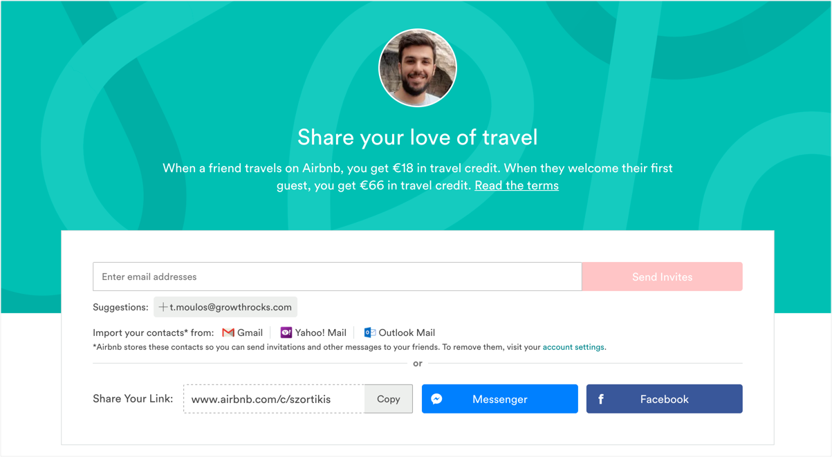
UX Highlights:
1. I can invite my friends through Facebook Messenger. Messaging is booming and it’s more probable to invite a close friends from Messenger rather than email—of course, that really depends on audience demographics and habits.
2. My referral code is not a random long code I cannot remember. It consists of my name “szortikis”—my name is Savvas Zortikis—this is really helpful as it can help you drive offline word of mouth. According to Jonah Burger, expert on virality and author of Contagious, mentions that 90% of word of mouth happens offline.
On top of that, having memorable referral links, converts better. It does so, because there is a conversion cycle between when an invite is sent to a friend, and when the friend clicks on that link or converts. So, having these kind of links helps your friends identify with minimum cognitive effort that this is an invite from a friend and keep them in context when visiting Airbnb after an invite.
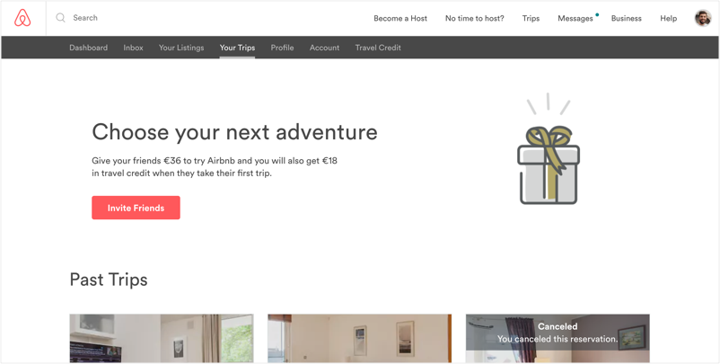
3. Multiple touch-points to increase user adoption. One of the main reasons viral and referral marketing campaign don’t work is because people don’t know about it. Companies “hide” the referral in a profile page.
Airbnb prompts people to invite their friends in multiple steps of the core booking experience. For example, if you go to your trips page, you can invite your friends to get travel credit before paying.
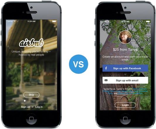
4. Personalization in the sign up page of their mobile app after coming from an invite. When you follow an invite link you are redirected to the app store to download the Airbnb app. Instead of showing the regular sign up page, they want to keep you in context and personalize the sign up page as illustrated below:
2. Monzo
Monzo is an online bank in the UK. Their growth strategy is solely based on referrals, virality and community marketing. They use the waiting list referral approach at their core sign up process.
Here is a short teardown of their UX—I’m using images—“show, don’t tell” 🙂
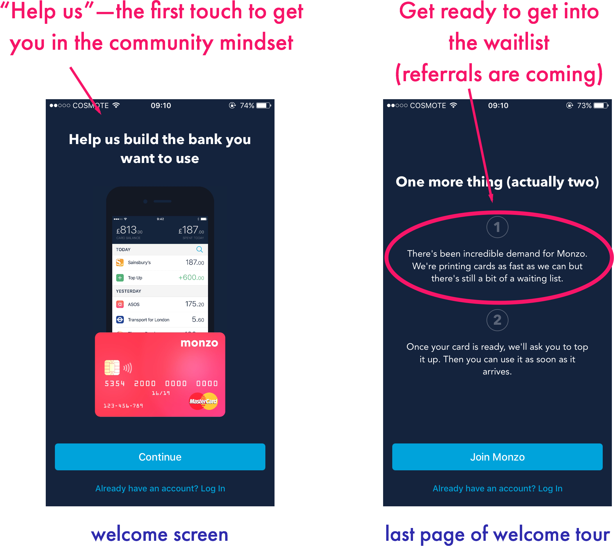
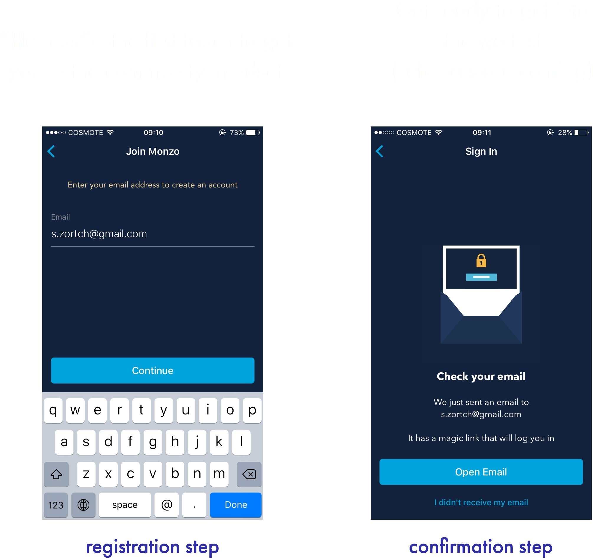
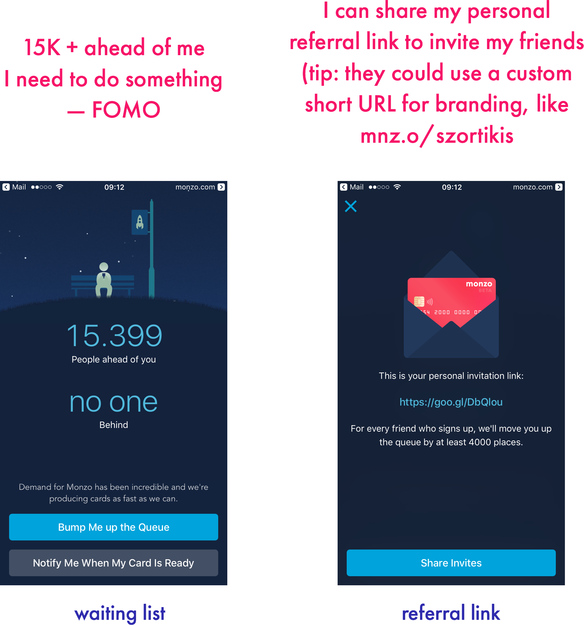
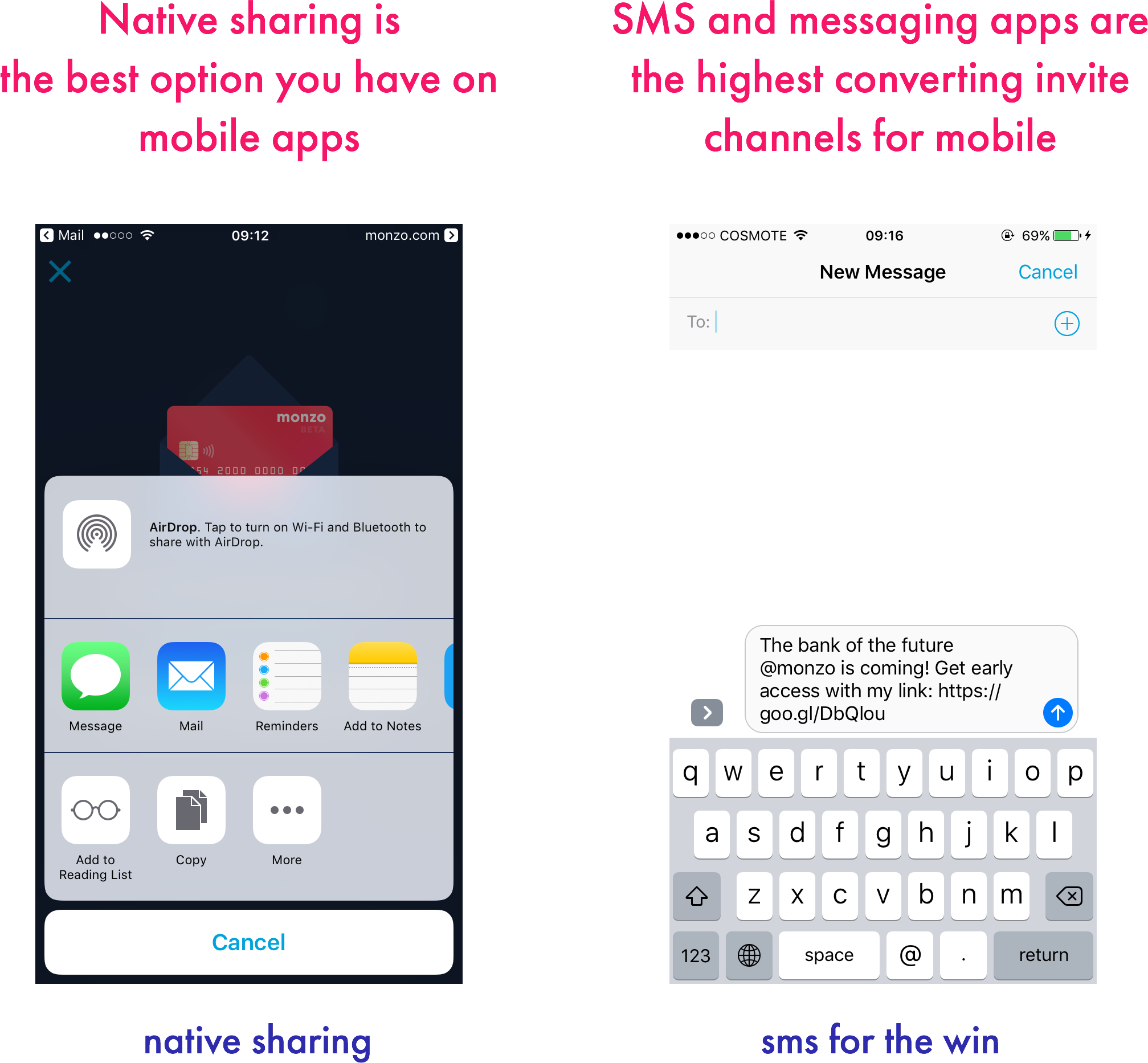
What’s really interesting, is that they continue the waiting list marketing approach after launching in 2015 with more than 150K sign ups and 20K cardholders.
3. Vision Mobile (Developer Economics)
Developer Economics is part of Vision Mobile—the biggest company that run surveys and produce reports for the mobile app, helping developers find insights and research data on platforms, tools & APIs.
To get more survey completions, they have a referral program in which based on the number of friends you invite, you climb up a leaderboard to get monetary rewards.
Their audience is tech people and developers who use mainly Twitter (more than Facebook). So, the team of Vision Mobile did an experiment that brought them 5x times more referrals. They created the Handpicked tweets through Viral Loops, the viral and referral marketing platform[1] they use.
4. Mixmax
Mixmax is my favorite email add-on to track who opens and clicks my email. It has also more great features for outreach and scheduling meetings. I’m a big fan!
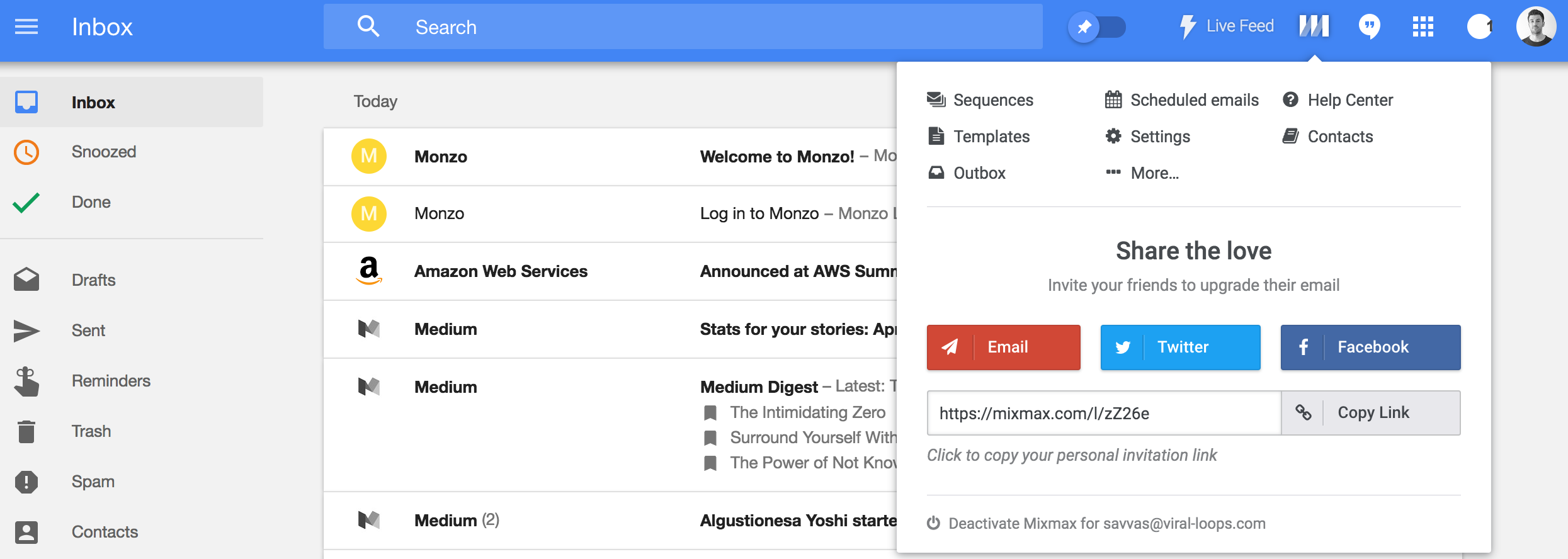
And because, I love using this product, I want to tell my team and fellow founders and marketers about it. For two reasons: help them improve their productivity and sales efforts, as well as for social currency—I was the one who found it first :P.
Mixmax makes it really easy to invite a friend directly :
5. Pipedrive
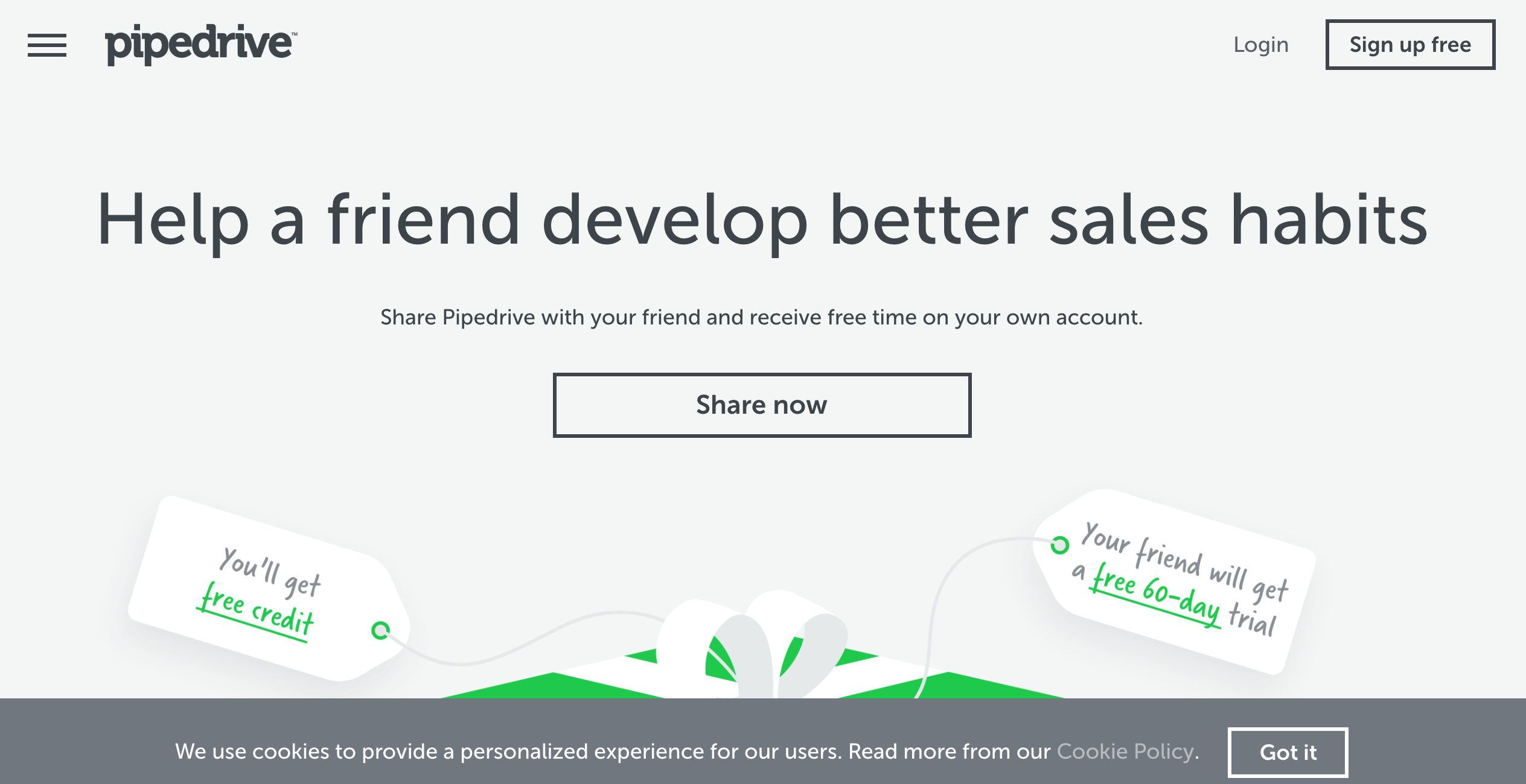
Pipedrive is a CRM. The hack I really love is that after you leave the app or logout, they serve a welcome back page and prompt you to invite your friends. They do so with a simple cookie.
6. Live True London
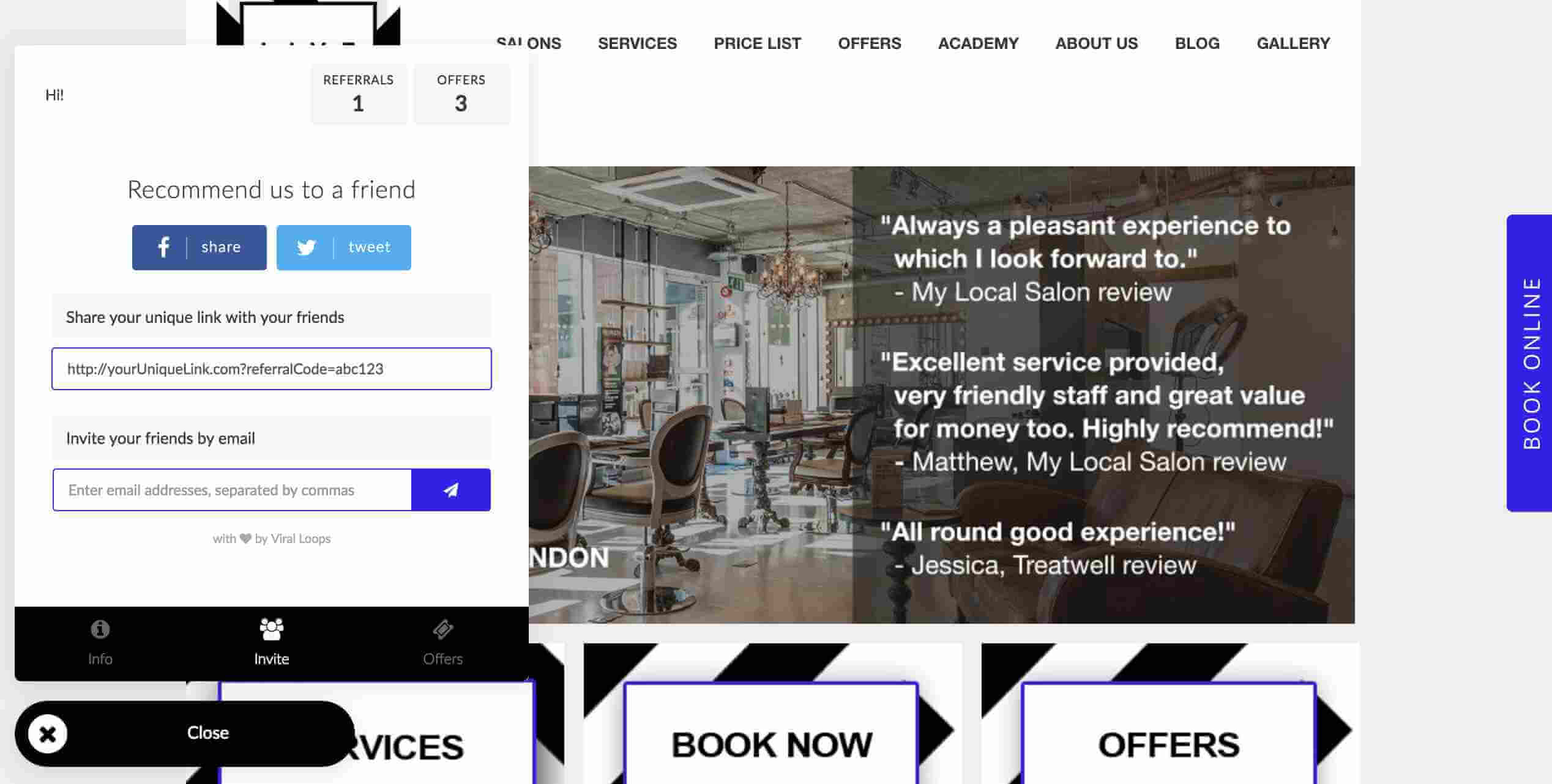
Live True London is one of the most well-know beauty salons in London. They use a referral program to get foot traffic through referrals from their website. They use a neat widget that is integrated into all of their website pages (disclaimer: I run Viral Loops :).
This widget is similar to a chat widget (e.g. Intercom or Drift) that people are used to interact with. This way you don’t have to lead people to another page and make it more complex to invite their friends.

1 comment
Great ideas. Will tell what really worked.