The last 3 years I had the pleasure to work with quite a few eCommerce stores and Marketplaces.
More than 60% of those cases, had to do with improving their Conversion Rate. While A/B testing, Heatmaps & fancy design (fancy doesn’t mean it provides good UX) are crucial in optimization, there are some aspects that not too many people take under serious consideration.
In my experience, it all comes down to 5 things:
- Site Performance
- Amazing targeting
- Eliminating Distractions
- Retention
- Making purchasing easy
Let’s examine these factors in more detail.

Allow me to explain; You have to make sure that your site performs the way it’s supposed to, in all browsers and devices.
- Does it take a lot of time to load? People will leave. (btw, 3 seconds is a LOT)
- Does it have the slightest bug? People will bounce mate!
So, how can you spot and fix these conversion killers?
Well, for your sites speed you can start by:
- Choosing the right server
- Optimizing your images
- Making use of browser caching
- Compressing your site
- Optimizing your CSS
I strongly advise to take a look at these articles, as they offer a more sophisticated approach to the particular subject:
- 15 Tips to Speed Up Your Website
- How to Improve Your Page Load Speed by 70.39% in 45 Minutes
- 10 Ways to Speed Up Your Website – and Improve Conversion by 7%
- 5 Easy Ways to Help Reduce Your Website’s Page Loading Speed
Get rid of bugs!!!!
You have to find in which browser and device your website underperforms. To do so, open up your Google Analytics and go to Audience -> Technology -> Browser & OS report.
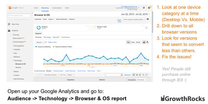
Bear in mind, you must search at one device category at a time (use segmentation for Desktop Only, Mobile Only and Tablet Only).
Drill down to a specific browser version (e.g. Firefox 36.0, 35.0 etc.) and look for browsers that seem to convert less than others.
So, if for example Firefox 36.0 & Firefox 27.0 convert at 4.5% and Firefox 35.0 converts at 1.22%, it’s possible that version 35.0 has some cross-browser issues.
I would recommend adding the performance of each browser separately in a spreadsheet.
The next step is to discover how the number of conversions would be if Firefox 35.0 (converting currently at 1.22%) converted as Firefox 36.0 or Firefox 27.0 (currently converting at 4.5%).
This is a smart way to prioritize your efforts on fixing the bugs.
Now that you know where to search for the issues, it’s time to find them. For this, it’s not required to have a ton of devices with every browser version installed.
Thanks to services like BrowserStack, CrossBrowserTesting and Browserling these otherwise annoying tasks become a piece of cake.
Note the bugs down and start with fixing them (or you can give them to a developer!).
(Source: 5+1 eCommerce Growth Hacks To Skyrocket Your Sales)
Imagine if Supreme clothing was targeting 40-year-old construction engineers and housewives along with young rich kids that like Kanye West and Tyler The Creator.
Just NO!
You can’t really expect to sell to goth teenagers looking for creeper shoes, by landing them to your vague shoe category.
Not everyone belongs to your funnel!
People know what they are looking for when buying online (maybe not the exact product, but they have an idea), so you should give them what they want without allowing them to waste time.
Most eCommerce owners assume that from the moment that people land on their store, they are ready to buy and that the reason their Conversion Rate looks like sh!t, is that there is something wrong with the store itself (which in most occasions is true).
Making sure the right person lands on your store increases the chances for that person to buy!
So, how you do that?
- Build themed Landing Pages
- Create more Content around your products
- Up your Email Marketing
- Use remarketing the right way
In order to get the insight needed in order to build the right campaign, you have to give a detailed look on your existing customers.
Who are they? What’s their age? What do they like to purchase?

You have to keep in mind that most people are very keen on being distracted.
You have to ask yourself on which pages you don’t want your visitors to be distracted. Most probably the answer is in the Checkout page.
Get rid of anything that can get visitors out of the checkout page. This includes:
- Header
- Navigation Menu
- Search Bar
- Showcase of other Products
- Footer
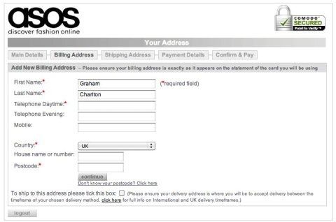
By excluding the navigation menu and search bar, all irrelevant distractions are eliminated and this allows the consumer to focus on making the purchase.
That way you can also highlight other important information like delivery details and customer service contact details.
In addition, security messages get more exposure, offering emotional security.
Also, that way it’s made clear to visitors in which step of the checkout process they are and how many steps they have left to complete the transaction.
e.g. What ASOS’ checkout page looks like:
(Source: Econsultancy | Achieve Digital Excellence)

On an interview we held with Dan Wolchonok, he made things pretty clear:
“If you don’t have good retention, nothing else matters”
According to Hubspot, on an average eCommerce store, 8% of the traffic is generating 40% of the revenue. Guess what’s that 8%.
People that purchased from you 2 or more times.
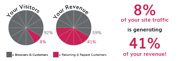
Satisfied customers are more likely to buy again from you, which practically means that focusing more on bringing these people in than acquiring new visitors, can improve your Conversion Rate dramatically.
“But how do I achieve that?”
You can start by providing ASTONISHING CUSTOMER SERVICE. Be there 24/7. Answer all questions and offer your help.
Another strong incentive is by providing exclusive offers/discounts.
Personally, I like loyalty programs which, in a nutshell, means rewarding existing customers for taking specific actions (e.g. making a purchase or inviting a friend) by using a point system.
You can easily build a loyalty program for your store using Viral Loops which comes with a loyalty program template inspire by Nordstrom.
Let’s think consumer-wise for a minute. What makes a perfect online purchase?
I mean, why people buy stuff online even if the same brand’s physical store is located 10m from their apartment?
The answer is TIME!
“Time is money” is more relative than ever before. You don’t want to waste your customers’ time.
The first step of doing so is to create an amazing navigation menu. If I’m looking for a red shirt, I want to be looking at it in seconds!
Now that I found my soon-to-be favourite red shirt, I want to add it to my cart. Is the “Add to Cart” button in the right place?
What means the “right place” after all?
The right place is everywhere the customers’ eyes land, meaning that the button should be visible whether the visitor looks at the pictures of the product or scrolls down to read the specs.
…
I hope my answer helped you! If you have any more questions that you may think my input is needed, just request an answer from me!
Cheers 🙂
