Announcing a new website or product can be both scary and exciting. Will people care? Will they sign up? Will anyone request early access?
That’s where a coming soon website landing page becomes your secret weapon. These pre-launch landing pages aren’t just placeholders; they’re powerful tools that build anticipation before you even open your doors.
A thoughtfully designed coming soon page design can transform a quiet launch into a successful launch with significant engagement.
By examining various page examples, it’s clear that pre-launch pages give you a valuable opportunity to capture leads, test your messaging, and create buzz necessary for a successful product launch.
Throughout this post, you’ll discover what makes these landing pages effective, see real-world examples that delivered results, and learn how to create your own pre-launch strategy that works.
Ready to give your next project the runway it deserves?
In this article, you’ll discover:
- Why You Need a Coming Soon Landing Page for Your Next Launch
- The Key Elements of an Effective Coming Soon Page
- Strategies for Creating a Coming Soon Landing Page That Converts
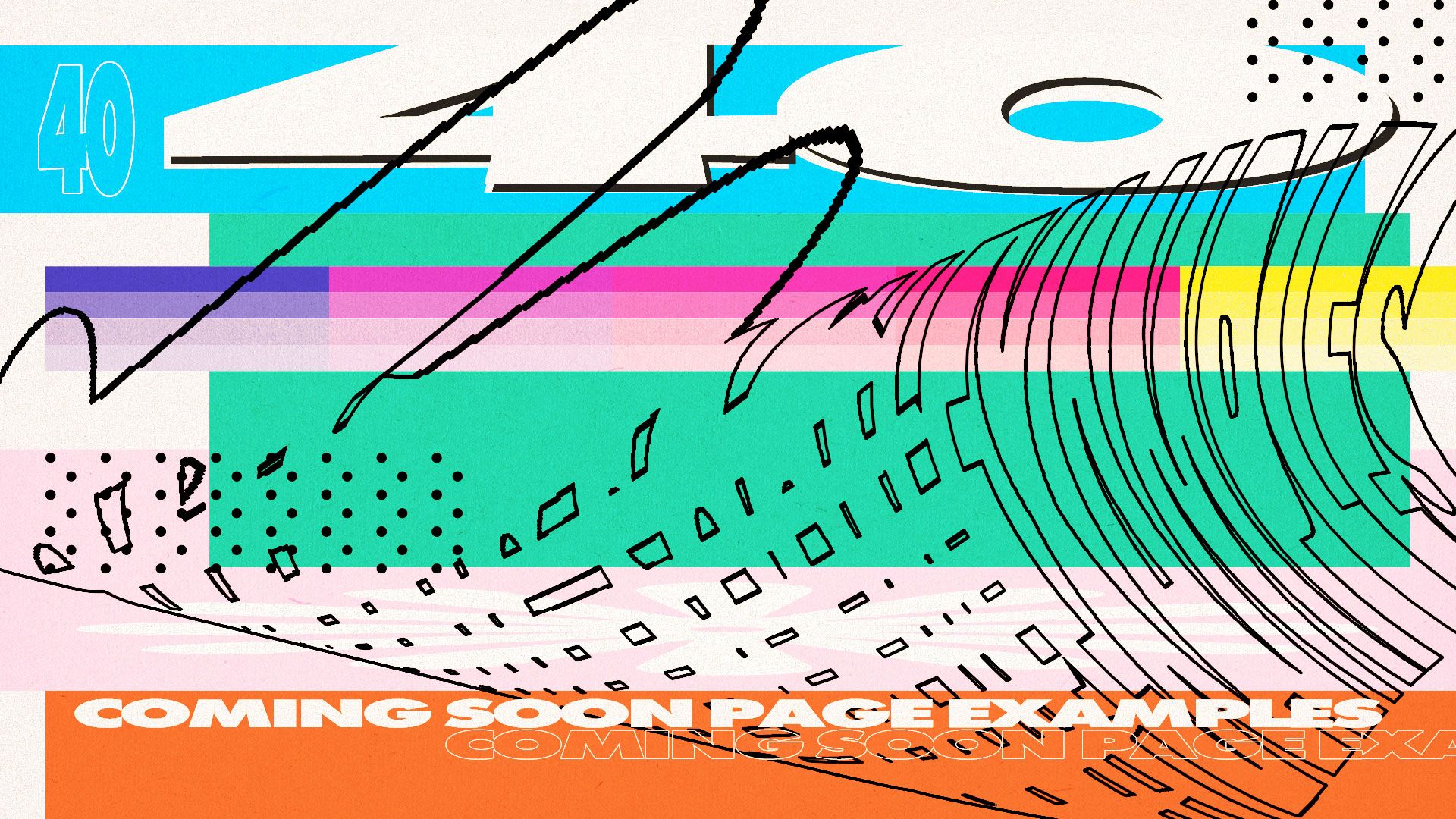
- 40+ Outstanding Coming Soon Website Landing Page Examples to Inspire You
- Essential Tools to Build Your Coming Soon Landing Page
Why You Need a Coming Soon Landing Page for Your Next Launch
Successful brands, whether established companies or startups, never just appear out of nowhere. Before launching, they build momentum using coming-soon pages.
While these temporary landing pages might seem simple, they’re actually strategic tools for a successful launch.

A well-designed coming-soon page gives potential customers a preview of your future offering.
Companies like Robinhood and Harry’s generated thousands of leads before completing their finished product through strategic planning with effective pre-launch landing pages.
These pages allow you to communicate your upcoming product’s value while still in development. Instead of working in secrecy, you can test your brand message with real audiences.
TheSkimm utilized strong branding on their coming-soon page to fan excitement and a dedicated fan base for their newsletter before launching their full website.
Pre-launch landing pages also function as lead-generation tools. By collecting email addresses and promoting social media accounts, you build brand awareness while creating an audience eager for your launch.
This audience becomes invaluable for gathering feedback. TeekTak used their coming-soon page to ask visitors what features mattered most, helping them develop a product people actually wanted.
From an SEO perspective, these pages give your domain a head start. Search engines begin indexing your site earlier, potentially improving your ranking when you fully launch.
A well-optimized temporary landing page improves your discoverability from day one.
Coming-soon pages build anticipation gradually rather than hoping for overnight success. The referral systems used by companies like Dropbox turned early adopters into marketing allies, spreading the word about their upcoming launch.
Finally, a professional product launch page establishes credibility, showing interested parties you’re serious about your offering. This professionalism can differentiate you from competitors who might appear hastily assembled.
Remember Apple’s product teasers? Their approach creates conversations and anticipation.
Pre-launch landing page that’s crafted well generates curiosity, communicates value, and builds relationships with potential customers before you’ve even launched.
The Key Elements of an Effective Coming Soon Page
Successful coming-soon pages across industries share common elements that drive results. What separates high-converting designs from those that fall flat?
The answer lies in several key components that create excitement and drive action.
1. Clear Value Proposition
A clear message is the cornerstone of effective pre-launch pages. Visitors should understand within seconds what problem your upcoming product solves or what benefit it offers.
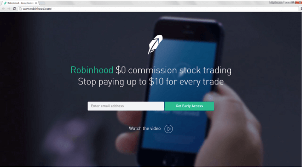
RobinHood’s coming-soon page succeeded with their straightforward message: “Commission-free stock trading.” This concise statement immediately communicated their unique advantage in the market.
2. Compelling Branding
Your coming-soon page must showcase consistent and memorable branding. Colors, typography, and voice should align with your overall brand identity. This consistency helps prospective customers connect with your brand before launch.
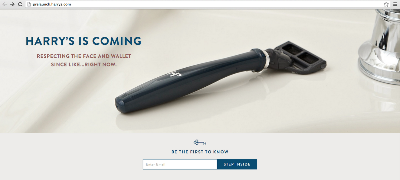
Harry’s Razors used their distinct brand personality on their pre-launch page to create excitement and form an emotional connection with visitors. Their approachable tone made their landing page instantly recognizable and shareable.
3. Strong Call to Action
A strong call to action transforms browsing into action. Generic buttons labeled “Submit” or “Enter” fail to build excitement.
Instead, effective pages use benefit-focused phrases: “Get Early Access,” “Join the Waitlist,” or “Be First to Know.”
The most successful coming soon page examples position CTAs prominently while clearly communicating the value visitors receive when clicking.
4. Simplified Email Capture
Email capture forms should request minimal information. Each additional field reduces conversion rates significantly. For most pre-launch pages, an email address is sufficient.
If more information is necessary, consider progressive profiling rather than requesting everything upfront.
5. Countdown Timer
Nothing creates urgency like watching time tick away toward a launch date. Countdown timers tap into the psychological principle of scarcity, compelling visitors to act immediately.
Companies like Freetrade and App Manager leverage this feature to drive immediate sign-ups.
Their pages transform casual interest into action by visually reminding visitors that time is limited. This simple element can significantly improve conversion rates.
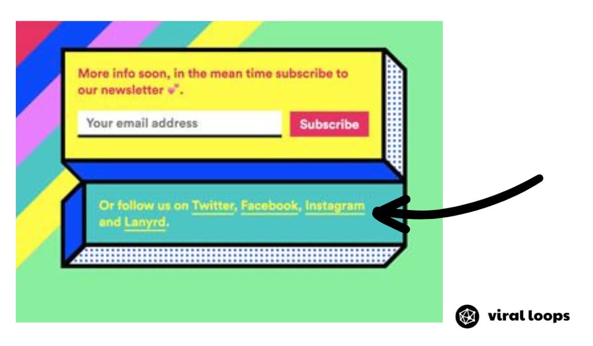
6. Social Sharing or Following Options
Social sharing buttons extend your reach exponentially. When visitors share your coming-soon page with their networks, they become advocates for your upcoming launch.
Dropbox mastered this approach by offering additional storage space to users who shared their pre-launch page.
7. Mobile Responsiveness
With over half of web traffic coming from mobile devices, your coming-soon page must display perfectly across all screen sizes. Testing across devices ensures no potential customers are lost due to poor mobile experience.
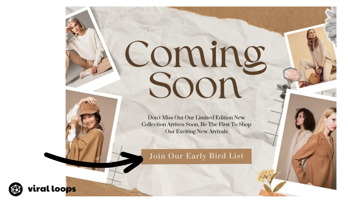
8. Engaging Visual Assets
Visual elements such as product screenshots, demos, or high quality images help visitors visualize your offering.
You can showcase your upcoming product capabilities through video demonstrations.
9. Credible Social Proof
Social proof transforms skeptics into believers. When designing your coming-soon page, incorporate testimonials from beta testers, logos of industry partners, or media mentions.
These elements reassure prospective customers that your upcoming launch is legitimate and valued by others.
Even without a finished product, gathering and displaying early feedback creates trust that boosts conversion rates and builds momentum.
10. Fast Loading Speed
Each second your landing page takes to load results in lost potential subscribers. Keep your design simple with minimal animations and lightweight graphics.
Choose landing page templates specifically built for speed and performance. Consider using a content delivery network (CDN) to serve your page faster to visitors worldwide.
Always test your pre-launch page on both desktop and mobile using tools like WebPageTest or GTmetrix. A fast-loading coming-soon page shows attention to detail and consideration for your target audience.
Strategies for Creating a Coming Soon Landing Page That Converts
Creating a coming soon landing page that captures leads requires strategic thinking beyond just assembling a temporary placeholder.
The difference between pages that convert and those that flop comes down to several key strategies. You can apply one or several of these key strategies below:
Keep It Simple and Focused
The most effective coming-soon examples maintain simplicity. When examining successful pages like App Manager, notice how they focus on a single message.
Avoid cluttering your landing page with unnecessary information that distracts visitors from taking action.
A clean design with high quality images creates an immediate positive impression.
Remember that your primary goal is to generate interest and build brand awareness, not to explain every detail of your future offering.
Craft Persuasive Copy
Your headline must immediately communicate value. What problem does your product solve? Why should visitors care? Effective copy speaks directly to your target audience’s needs and desires.
The description should be concise yet compelling enough to generate leads.
Balance Information Disclosure
Revealing enough information to spark early interest without giving away everything requires balance.
Provide sufficient details to establish credibility and explain your concept, but maintain some mystery to encourage visitors to sign up for launch notifications.
Create Exclusivity
Transform your standard email signup form into an invitation request that implies exclusivity. “Sign Up for Exclusive Updates” is a good CTA that follows this strategy.
Use a Countdown Clock
A countdown clock transforms passive browsing into active decision-making. When visitors see time ticking away, psychological triggers activate that combat procrastination.
You can display days, hours, and minutes until your launch date, creating a sense that opportunities might be missed.
For maximum impact, pair your countdown with limited-time incentives such as “first 100 subscribers receive 50% off” to further drive conversions and add urgency.
Just ensure your displayed launch date is realistic. Missing deadlines damages credibility with early supporters.
Implement Referral Mechanics
You can offer discount or credit for both referrers and friends who signed up to the exclusive mailing list we mentioned above. This referral system can expand your reach exponentially while reducing acquisition costs.
Consider how similar mechanics might help your pre-launch campaign spread through social networks.
Recommended Reading: How to Set Up a Referral Program for Your Business in 5 Steps
Add Incentives
Offering tangible benefits for signing up creates immediate value for prospective customers and their referrals.
Consider providing:
- Early access: First access creates a VIP feeling and allows early adopters to purchase before the general public. Robinhood effectively used this strategy by creating tiered access based on referral counts.
- Founder’s discounts: Special pricing reserved only for pre-launch supporters acknowledges their early faith in your product. Companies like WebConf.asia offered significant price reductions to email subscribers who joined before the official announcement.
- Exclusive content: Educational resources, guides, or insider information can be compelling for knowledge-hungry audiences. This works especially well for SaaS products where future customers want to learn usage strategies before launch.
- Free trial period: Extending trial periods exclusively for coming-soon page subscribers creates significant perceived value. Superhuman used this approach by offering longer testing periods to those who signed up through their pre-launch campaign.
Recommended Reading: How to choose referral rewards and referral incentives
Track Performance Metrics
Data transforms guesswork into strategy for your coming-soon page.
Establish baseline metrics and monitor improvements as you refine your approach:
- Conversion rate (visitors to sign-ups): This fundamental metric reveals how effectively your value proposition and design capture potential leads. The top 25% of landing pages can convert more than 5% of their visitors.
- Traffic sources: Different channels bring visitors with varying intent levels. Social media might deliver volume, but email referrals often convert at higher rates.
- Email open rates: Track how many subscribers open your follow-up communications. Low open rates suggest your subject lines need optimization or your initial promise doesn’t align with follow-up content.
- Social sharing metrics: Monitor how often visitors share your coming-soon page across platforms. Higher sharing rates indicate strong market resonance and multiply your reach without additional spending.
These metrics reveal opportunities for optimization before your official launch, potentially multiplying your early customer base.
Test and Optimize
Even before launch, A/B testing different elements of your coming-soon page can significantly improve conversion rates. Test variations of:
- Headlines and copy: Try different value propositions to see which resonates most with your audience. A small wording change can sometimes double conversion rates.
- CTA button text and color: Test action-oriented text against benefit-oriented text and high-contrast colors against brand colors.
- Email form placement: Above-the-fold placement typically converts better, but testing confirms what works for your specific audience.
- Background images: Different images can evoke different emotions and appeal to different segments of your target market.
Modern page builders make these tests simple to implement without technical knowledge. Track which versions generate more leads to continuously improve performance.
40+ Outstanding Coming Soon Website Landing Page Examples to Inspire You
Studying successful page examples provides valuable insights into effective strategies. These ten outstanding coming soon landing page examples demonstrate techniques for getting leads and creating anticipation before launch.
1. Robinhood: Referral Marketing Done Right
Robinhood focused on clarity: “Commission-free stock trading.” This headline instantly communicated their value proposition. What truly set their landing page apart was their waitlist referral system.
Users could move up the waiting list by referring friends, which created exponential buzz. The minimalist design allowed the value proposition and referral mechanic to take center stage.
2. Harry’s: Storytelling and Anticipation
Harry’s coming-soon landing page combined strong visuals with storytelling. Their landing page encourages visitors to join by explaining the problem they were solving in the razor industry.
They implemented a referral program that rewarded users for sharing, further extending their reach. The design aesthetic perfectly matched their product line, creating brand consistency even before launch.
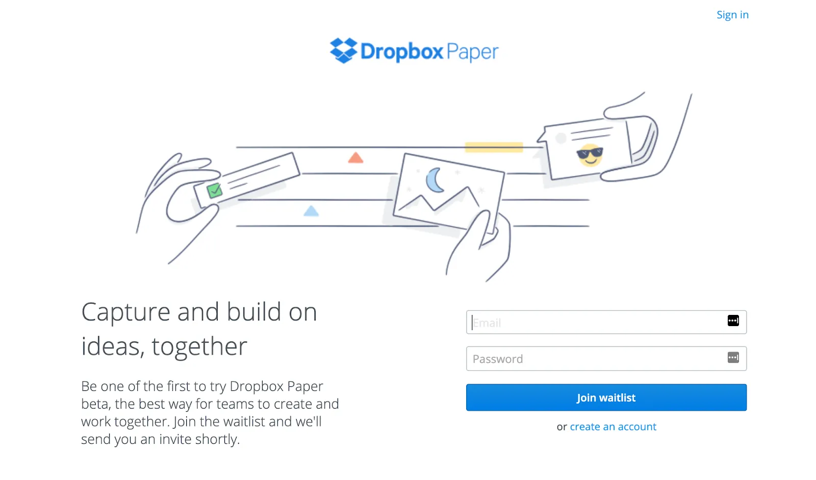
3. Dropbox Paper: Simplicity and Clarity
This coming soon landing page demonstrates the power of simplicity. Dropbox Paper used a clean, minimalist design with ample white space to highlight their product’s value.
The attention-grabbing headline clearly explained what the product would do, while the straightforward signup form removed barriers to conversion. This approach generated substantial pre-launch interest.
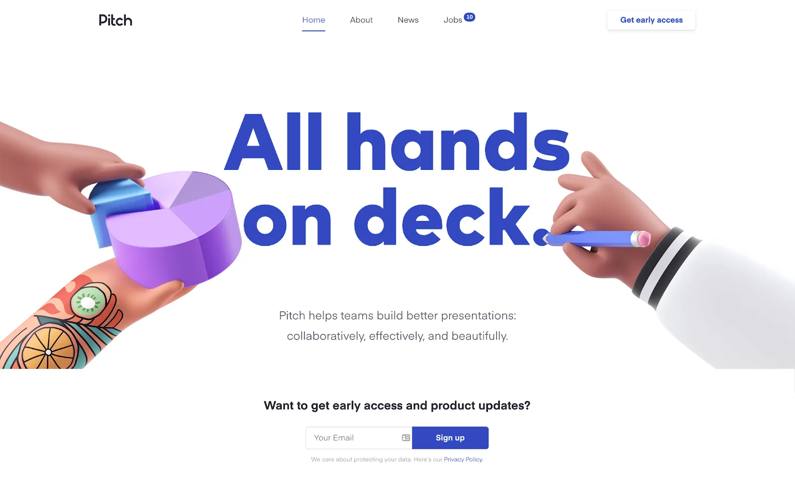
4. Pitch: Exclusivity and Scarcity
Pitch created an atmosphere of exclusivity with their coming-soon landing page. Rather than a standard email signup, they implemented a “request access” approach, making users feel they were joining something exclusive.
The sleek design with subtle animations maintained visitor interest while communicating professionalism. This strategy helped them build a quality waiting list of engaged potential users.
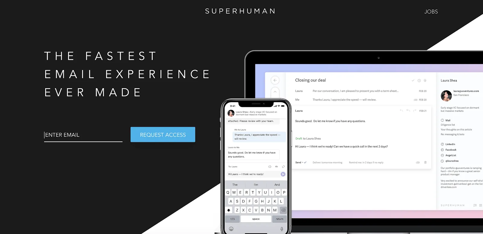
5. Superhuman: High-Quality Visuals
Superhuman’s coming-soon landing page leveraged beautiful background images and sophisticated design to convey premium positioning.
Their page requested detailed information about potential users’ email habits, allowing them to both qualify leads and solicit feedback for product development. This approach ensured their waitlist contained ideal users who could provide valuable insights.
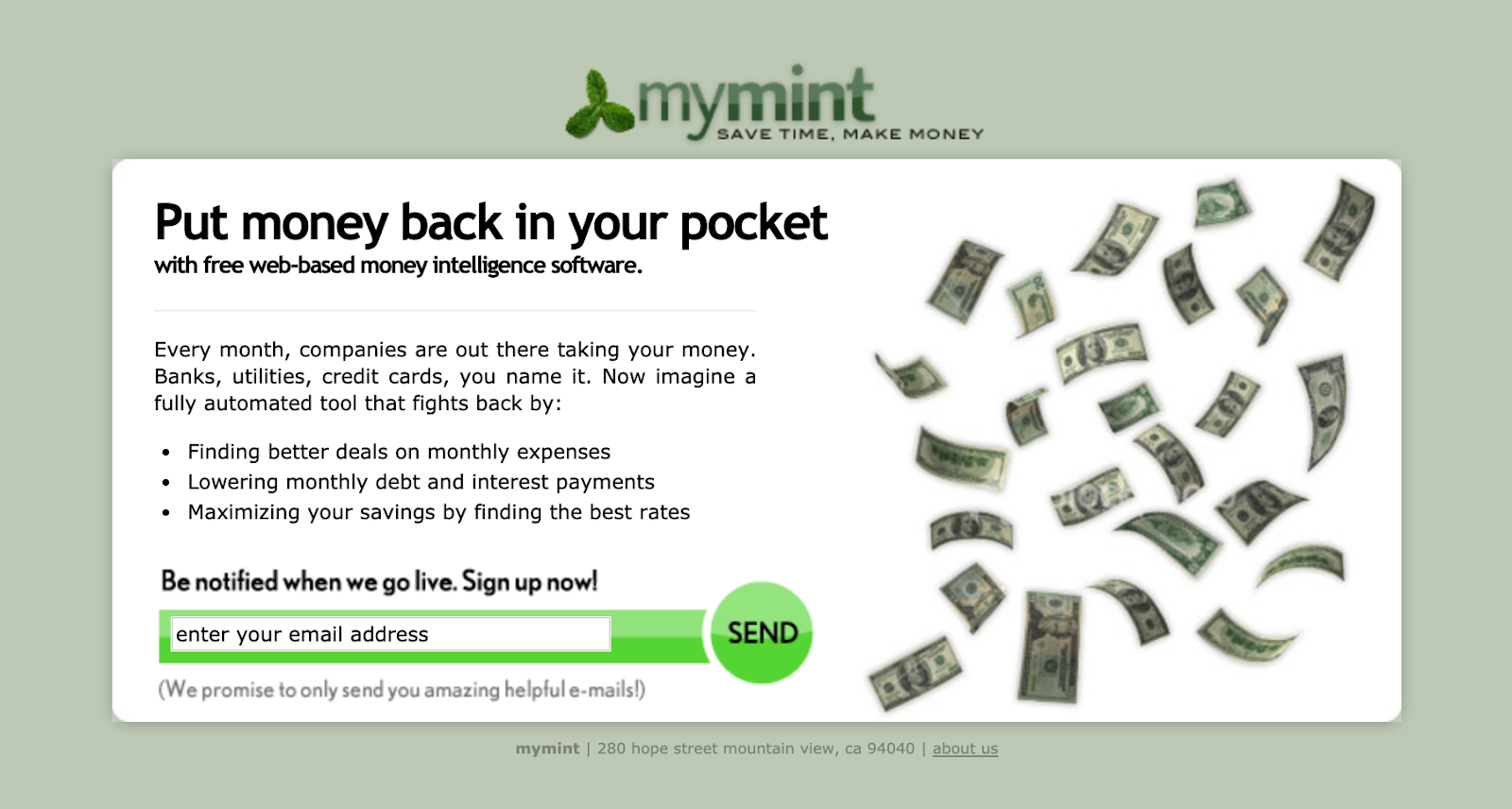
6. Mint: Problem-Solution Framework
Mint’s coming soon landing page focused on the financial problems their product would solve. The compelling headline directly addressed pain points, while the page copy elaborated on the solution.
By framing their product as the answer to common financial frustrations, Mint generated significant interest before launch. Their form captured just enough information to enable personalized follow-up.
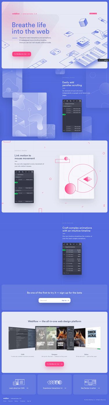
7. WebFlow Interactions: Interactive Demonstrations
WebFlow’s coming-soon landing page for their Interactions feature showcased the product through video demonstrations.
This approach allowed visitors to see the product in action before it was publicly available. By displaying the actual interface, WebFlow reduced uncertainty and increased conversion rates among their target audience of designers and developers.
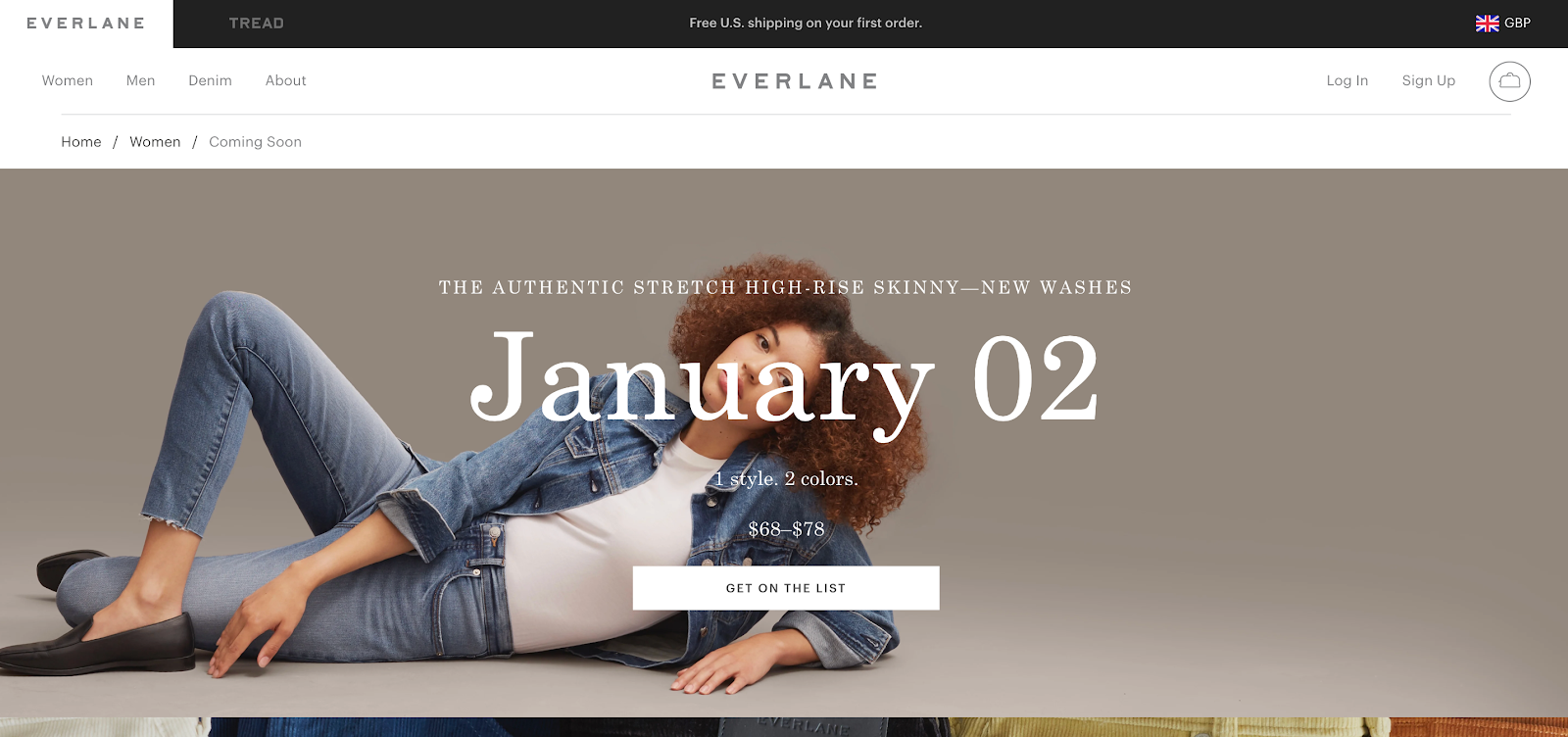
8. Everlane: Transparency and Values
Everlane’s coming-soon landing page balanced aesthetics and messaging perfectly. Their page featured minimal text but powerful imagery that reflected their product line.
This example was particularly effective because it showcased their commitment to transparency in an industry known for obscurity. The landing page design mirrored their fashion items’ clean, straightforward approach, creating immediate brand recognition.
With their email signup form strategically placed against carefully selected background images, they captured leads from fashion-conscious consumers who responded to their ethical approach.
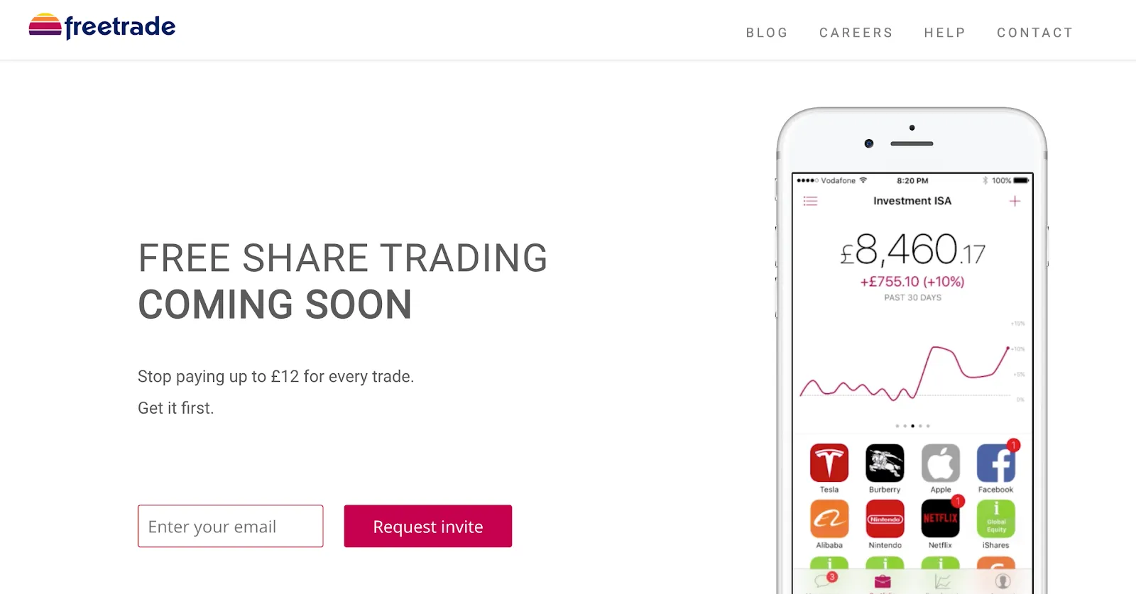
9. Freetrade: Urgency with Countdown
Freetrade effectively used a countdown timer on their coming soon landing page to add urgency. This visual element encouraged visitors to sign up promptly rather than postponing their decision.
Combined with focused messaging about commission-free investing, the landing page generated substantial pre-launch momentum. Their mobile-optimized design ensured a positive experience across all devices.
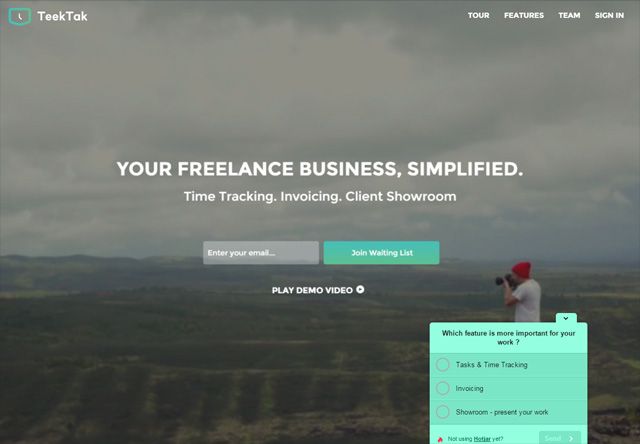
10. TeekTak: Gathering Valuable Feedback
TeekTak created a coming-soon landing page that performed double duty—generating leads while collecting crucial product development insights. Their headline, “Your Freelance Business, Simplified,” immediately communicated their value while their form inspired visitors to share their biggest freelance management challenges.
This approach allowed TeekTak to refine features before launch day. The signup process was streamlined with clear messaging about notification priorities, ensuring a positive first impression.
This strategy helped TeekTak build both an email list and a community of invested users eager for their upcoming launch.
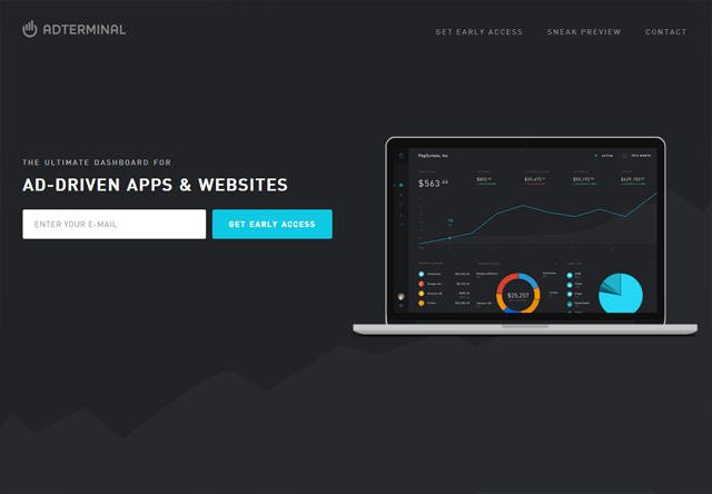
11. AdTerminal
AdTerminal’s coming soon landing page showcased a clean, data-focused design that reflected their advertising platform’s purpose. The page featured a gradient background with subtle animations that drew attention to their email capture form.
Their value proposition centered on revolutionizing how advertisers target audiences through advanced technology.
What made their approach distinctive was the interactive demo that allowed visitors to experience a simplified version of their targeting capabilities, creating engagement even before launch.
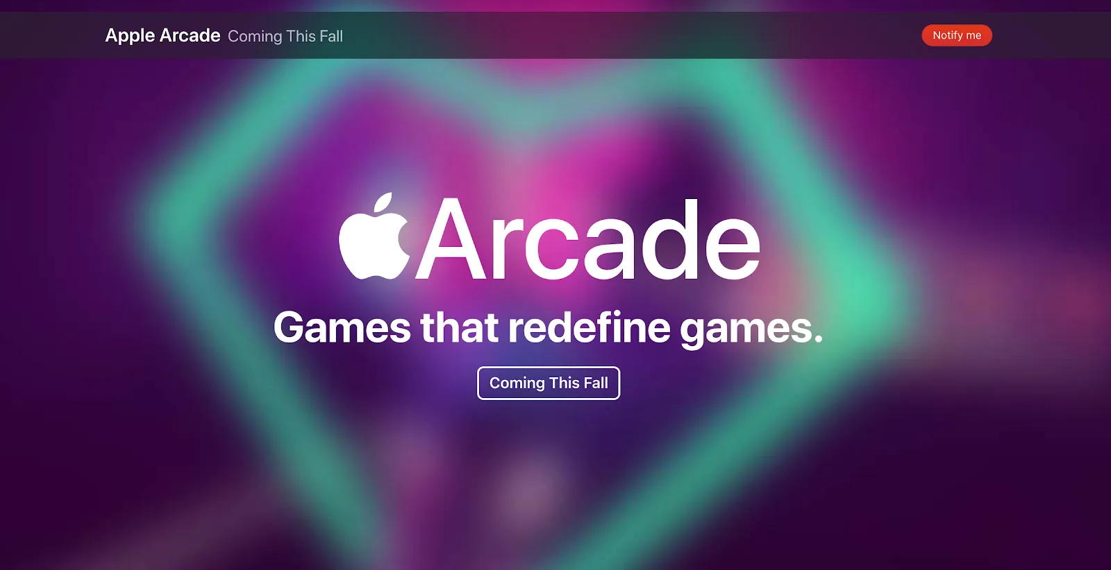
12. Apple Arcade
Apple Arcade’s coming soon landing page exemplified sleek visuals. The page showcased vibrant moving graphics, immediately capturing the user’s attention.
“Games the redefine games” gives the visitor a hint of exclusivity and how you can look forward to something “next-level.”
It also indicates “Coming next fall,” immediately setting expectations and increasing anticipation.
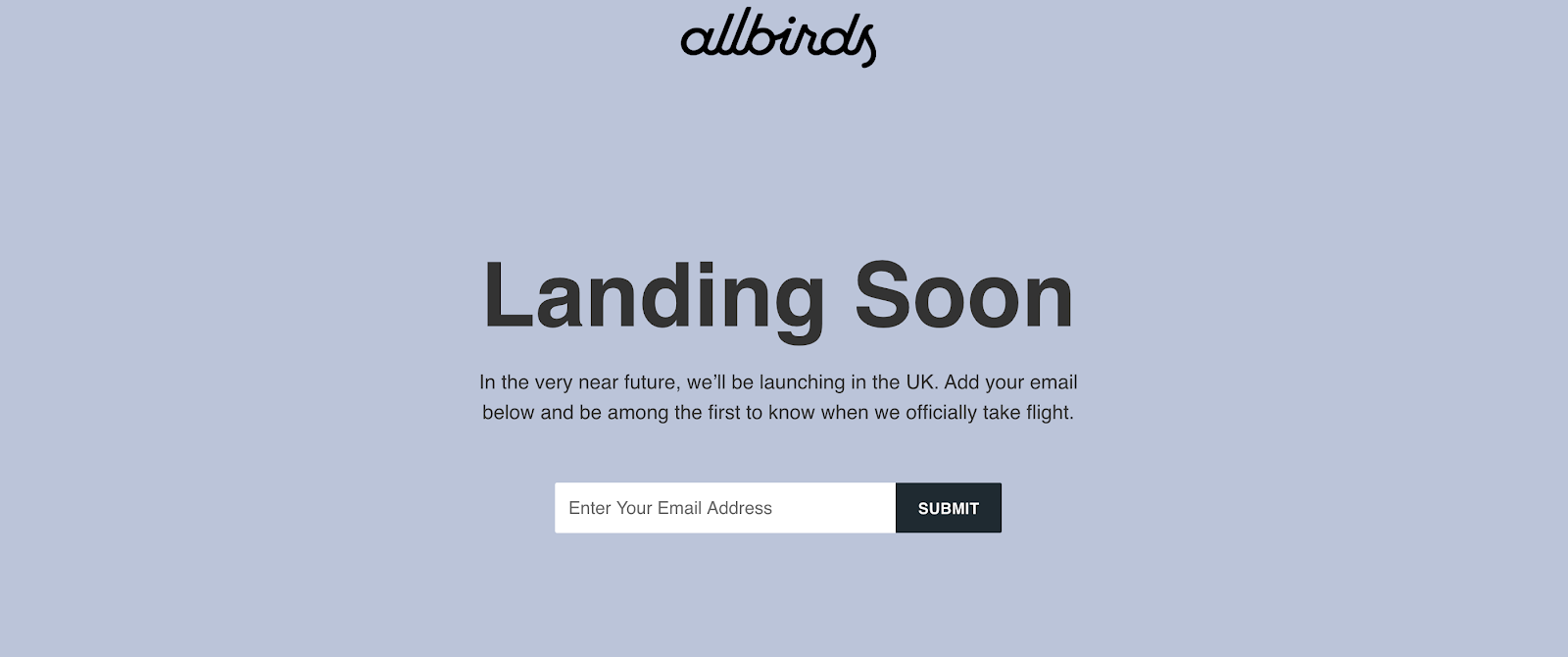
13. Allbirds
Allbirds’ coming soon landing page featured a clean, minimalist design with a soft blue background that perfectly aligned with their sustainable footwear brand identity.
The page used simple, direct messaging with “Landing Soon” as the headline, followed by text explaining their UK launch plans.
The email capture form was prominently positioned in the center of the page, with a straightforward “SUBMIT” button encouraging visitors to be “among the first to know when we officially take flight”—subtly referencing their bird-themed brand name while creating anticipation for their launch.
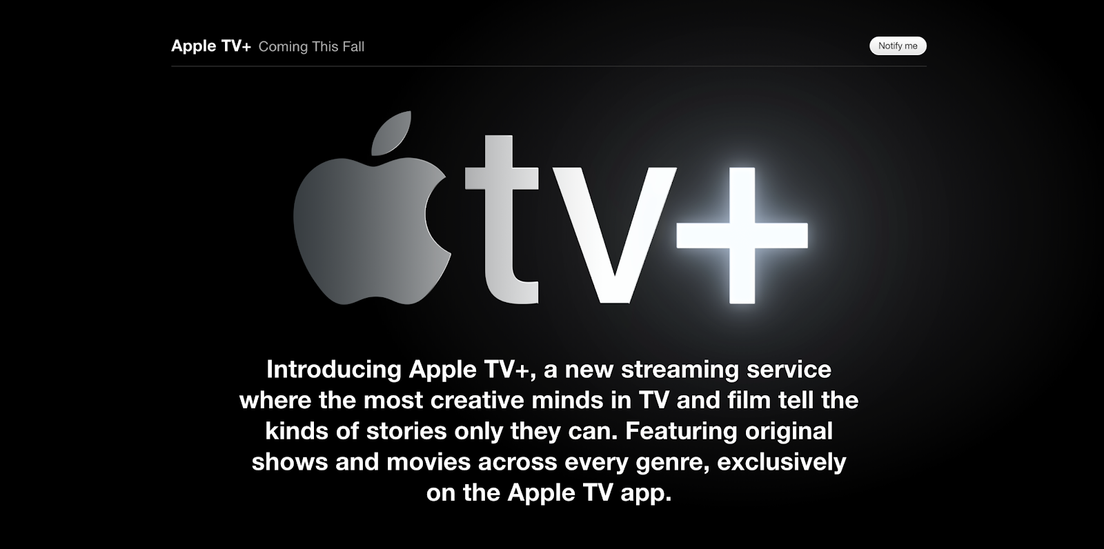
14. Apple TV+
Apple TV+’s coming soon landing page exemplified their signature minimalist aesthetic with a sleek black background showcasing their glowing logo.
The page featured concise messaging with “Coming This Fall” at the top and a simple “Notify me” button.
Below the logo, a clear value proposition explained exactly what the service would offer: “a new streaming service where the most creative minds in TV and film tell the kinds of stories only they can.”
This direct approach leveraged Apple’s established brand credibility while clearly communicating the exclusive content value proposition.
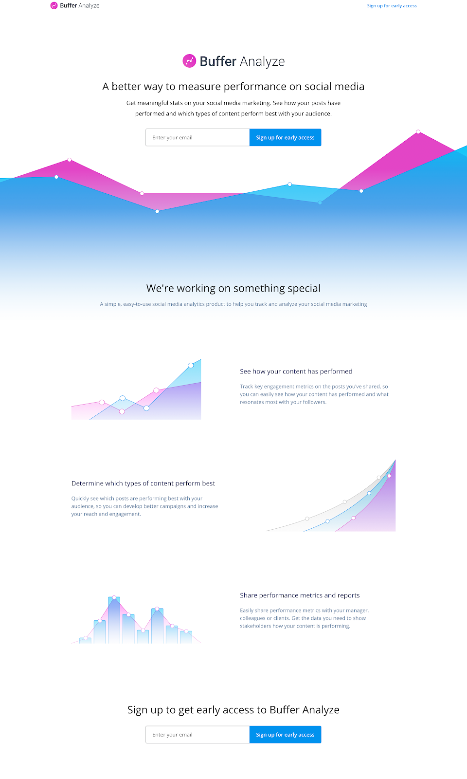
15. Buffer Analyze
Buffer Analyze created a data-visualization focused coming soon landing page that immediately communicated the product’s purpose through design.
The page featured animated graph elements in blue and pink that visualized the social media analytics tool’s functionality.
Their value proposition was clearly stated with “A better way to measure performance on social media” followed by specific benefits.
Multiple email capture opportunities were provided throughout the scrolling page, with each “Sign up for early access” button positioned strategically near feature explanations, maximizing conversion opportunities.
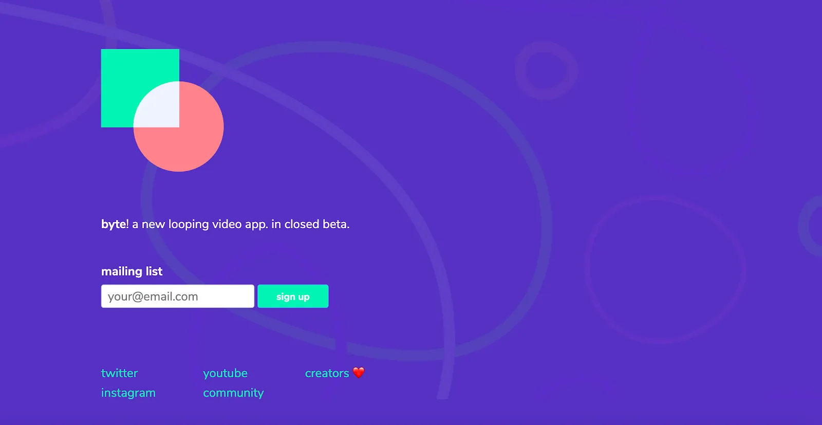
16. Byte
Byte’s coming soon landing page for their looping video app featured a bold purple background with geometric brand elements and simple, minimalist design.
The page communicated their product status directly with “byte! a new looping video app. in closed beta.” Their sign-up form was straightforward, labeled simply as “mailing list” with a bright turquoise button for contrast.
The page also included social media links, building a multi-channel community around their product before launch and establishing the brand’s playful, creative personality.
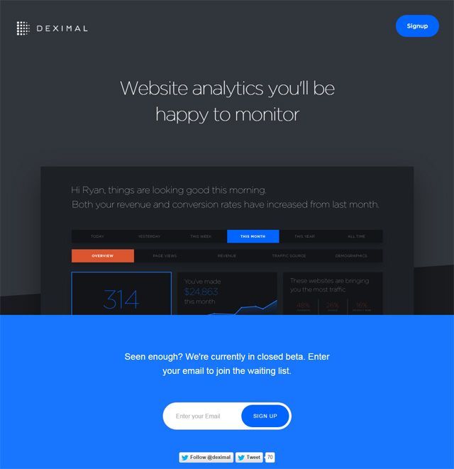
17. Deximal
Deximal’s coming soon landing page for their website analytics platform used a dark interface with a prominent product screenshot demonstrating the actual dashboard in action.
The page featured a clear value proposition: “Website analytics you’ll be happy to monitor” that immediately communicated both the product function and emotional benefit.
The page showed a personalized sample dashboard with metrics like revenue and conversion rates, giving visitors a preview of the product experience.
A bright blue call-to-action section at the bottom stated “Seen enough? We’re currently in closed beta. Enter your email to join the waiting list,” creating exclusivity while encouraging immediate sign-up.
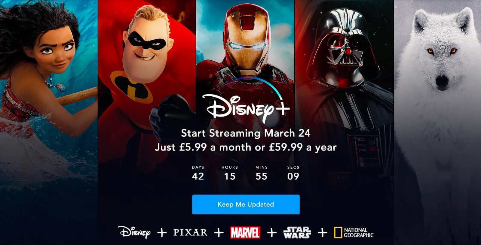
18. Disney+
Disney+ leveraged their powerful content library in their coming soon landing page, showcasing iconic characters from multiple major franchises including Moana, The Incredibles, Marvel, Star Wars, and their nature content.
The page provided clear launch information with “Start Streaming March 24” and pricing details. A countdown timer created urgency by showing days, hours, minutes and seconds until launch.
The “Keep Me Updated” button was prominently displayed in blue against the dark background, creating a strong visual call-to-action.
This approach effectively utilized Disney’s established intellectual property to generate excitement for their streaming service launch.
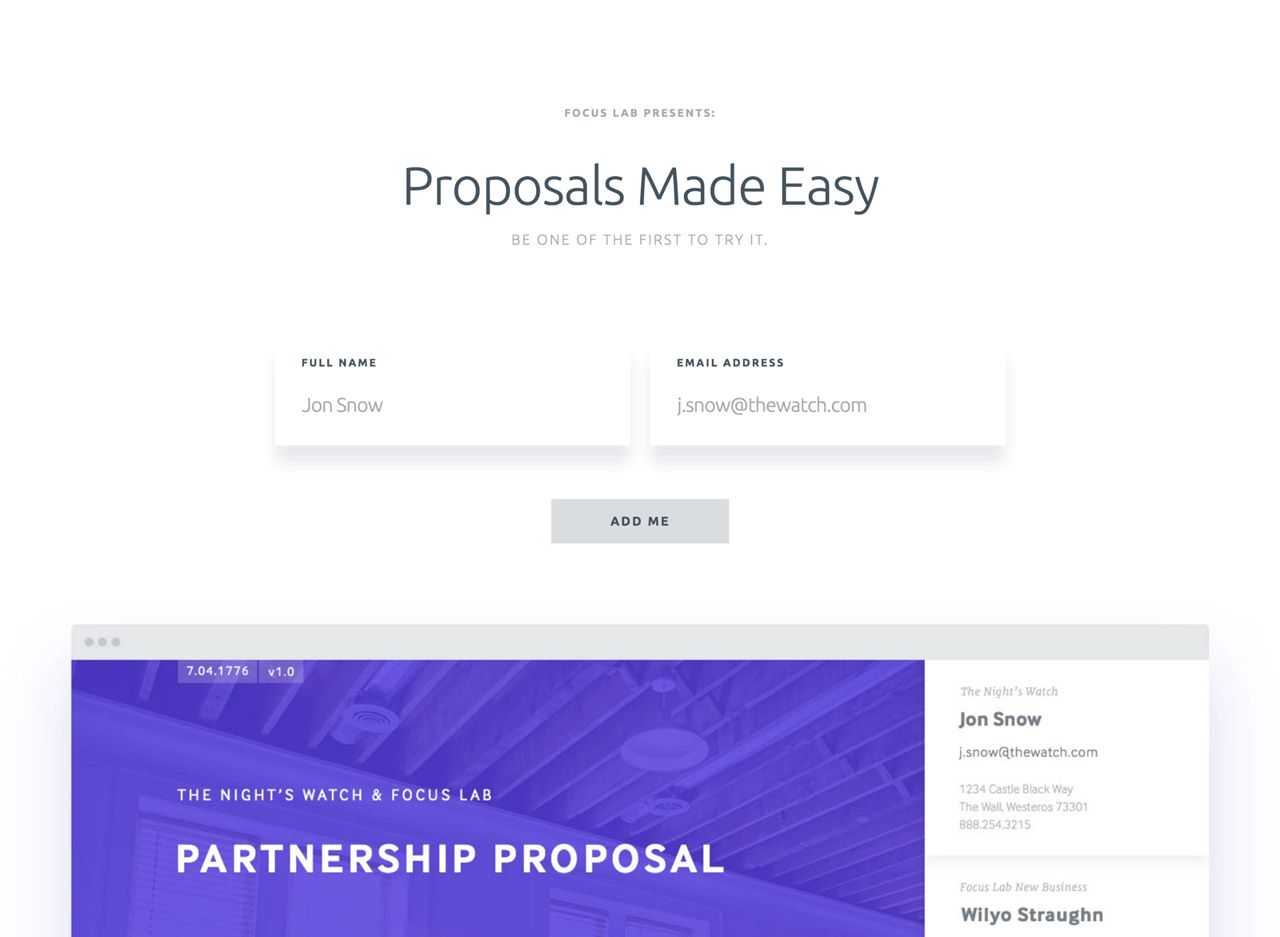
19. Proposals
Proposals’ coming soon page featured a clean, minimalist design with generous white space that reflected the professional document creation platform’s focus on simplicity.
The page used a subdued color palette with a clear headline “Proposals Made Easy” immediately communicating their value proposition.
The descriptive tagline “BE ONE OF THE FIRST TO TRY IT” created exclusivity, while the form requested both name and email, allowing for personalized follow-up communications.
The page cleverly included a sample proposal document preview at the bottom, demonstrating the product’s functionality and professional design capabilities before launch, setting expectations for potential users while showcasing the platform’s core value.
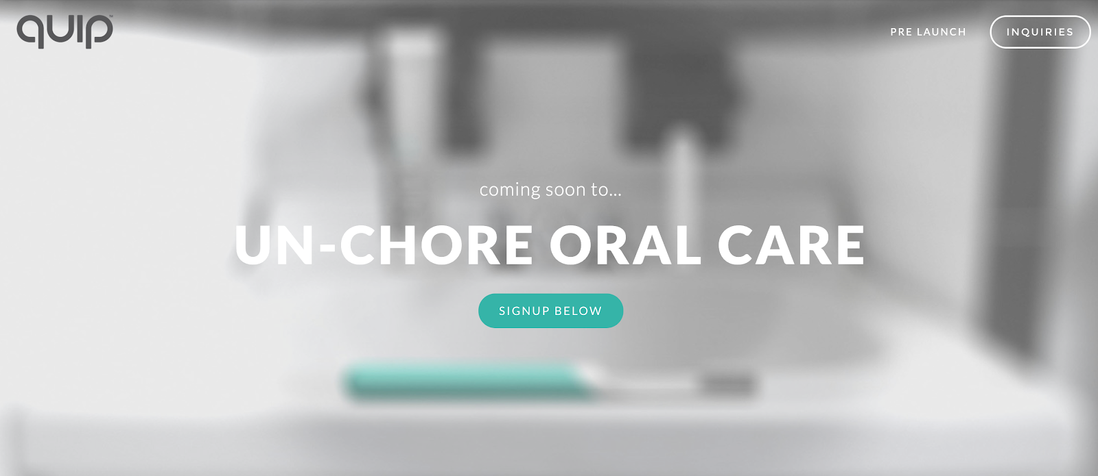
20. Quip
Quip’s pre-launch page for their oral care products featured a strategically blurred bathroom background with a teal toothbrush as the focal point.
The design utilized significant contrast with bold white text stating “UN-CHORE ORAL CARE” against the muted background, immediately communicating their unique value proposition of simplifying dental hygiene.
Their “coming soon to…” text created anticipation while the teal signup button provided strong visual contrast for conversion.
The minimalist approach with ample negative space conveyed the modern, clean aesthetic that aligned perfectly with their product category, creating brand consistency even before launch.
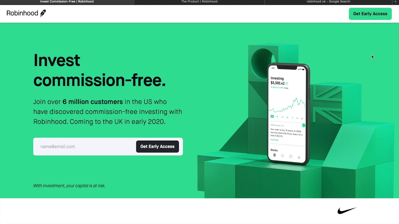
21. Robinhood (version 2)
We love Robinhood’s coming soon landing pages so much, we featured another version in this list! Robinhood’s multiple coming soon page iterations definitely exemplified strategic evolution of their pre-launch messaging.
Their initial coming soon page featured a dark background with a smartphone displaying their app, alongside the clear value proposition “$0 commission stock trading” followed by “Stop paying up to $10 for every trade.”
Later versions evolved to a vibrant green background with geometric elements that became their signature color, maintaining the consistent “Invest commission-free” messaging while adding social proof: “Join over 6 million customers in the US.”
Both versions featured prominently positioned “Get Early Access” CTAs that created exclusivity while their straightforward value proposition immediately communicated the revolutionary cost benefit, driving substantial pre-launch interest in their financial service.
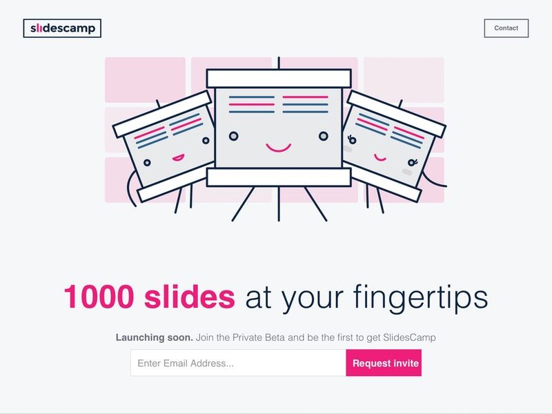
22. Slidescamp
Slidescamp’s coming soon page featured playful, cartoon-style illustrations of presentation slides with friendly faces, immediately communicating the platform’s approachable nature.
The page used a clean white background with a bright pink “1000 slides at your fingertips” headline that clearly conveyed the product’s core value proposition. Their approach focused on exclusivity with text stating “Launching soon.
Join the Private Beta and be the first to get SlidesCamp” alongside a vibrant pink “Request invite” button that created urgency.
This combination of friendly visuals and compelling copy effectively communicated the presentation template library’s value while generating anticipation through their invitation-based approach.
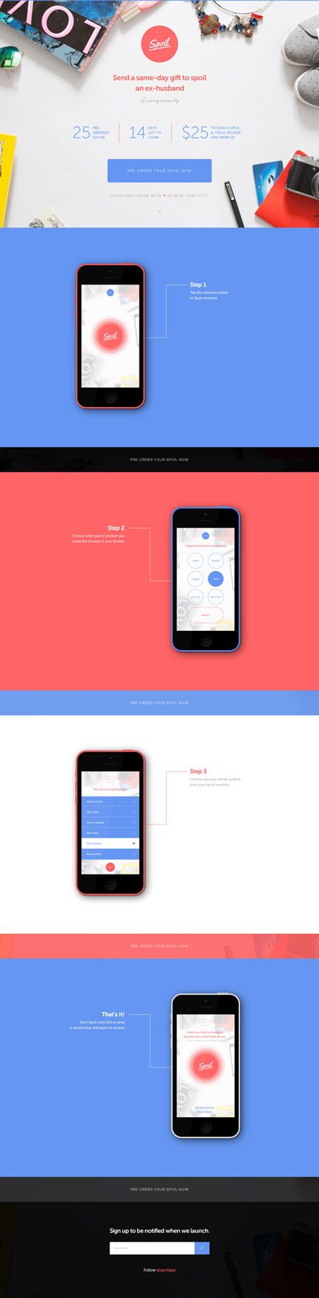
23. Spoil
Spoil’s coming soon page for their gift-giving service featured a clean, visually appealing design with product images at the top and a color-block layout alternating between blue, coral, and white sections as users scrolled.
The page clearly communicated their unique value proposition: “Send a same-day gift to spoil an ex-husband” with metrics showing “25 minutes average time to decide” and “$25 average gift price.”
This coming soon page demonstrated the app’s functionality through a step-by-step visual walkthrough of the user experience, building understanding of the service before launch.
A simple email signup at the bottom encouraged visitors to “be notified when we launch,” creating a frictionless path to conversion while maintaining the clean, modern aesthetic throughout.
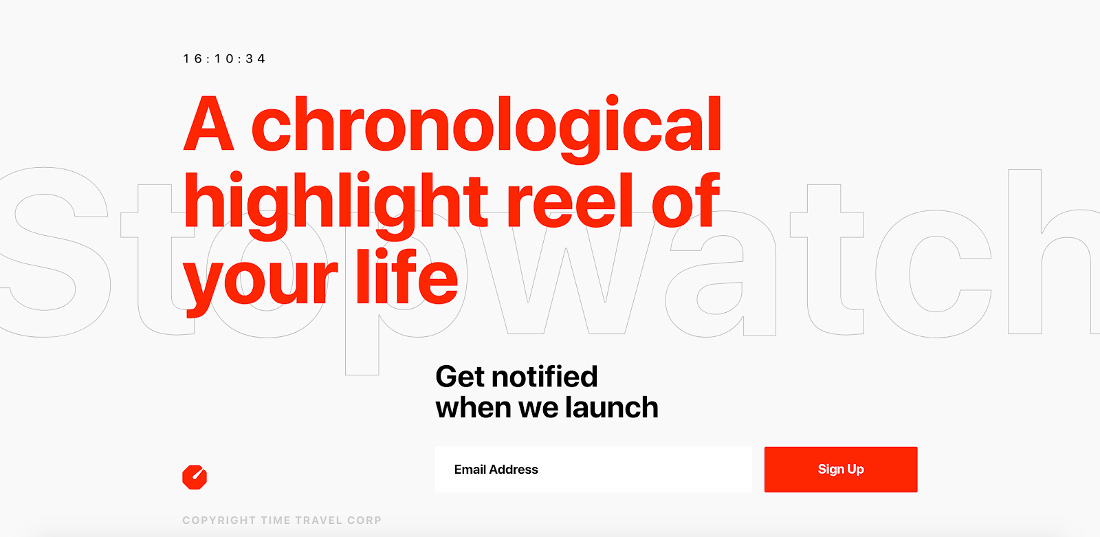
24. Stopwatch
Stopwatch’s coming soon page featured a striking minimalist design with a white background and bold red typography stating “A chronological highlight reel of your life” that immediately communicated their unique video memory service.
The page utilized significant white space with a running timer at the top, visually reinforcing the time-based nature of the product.
Their approach emphasized a simple value proposition with the clear call-to-action “Get notified when we launch” and a high-contrast red signup button.
The subtle “Stopwatch” text faintly visible in the background created depth while maintaining the clean aesthetic, effectively generating intrigue about their innovative time-based content platform before launch.
25. Stuvio
Stuvio’s pre-launch page for their generative art platform featured a stunning gradient background that transitioned from deep blue to purple, creating an immersive atmosphere that reflected the creative nature of their product.
The coming soon page used minimal but precise copy: “GENERATIVE, COLLABORATIVE, SINGLE EDITION ART PRINTS” followed by a clear explanation of their community-based approach to digital art creation.
Their simple “NOTIFY ME” button against the vibrant background created strong visual contrast for conversion.
The design’s modern, artistic aesthetic perfectly mirrored the creative product they were launching, effectively appealing to their target audience of digital art enthusiasts and collectors while maintaining an air of exclusivity with their “COMING SOON” message.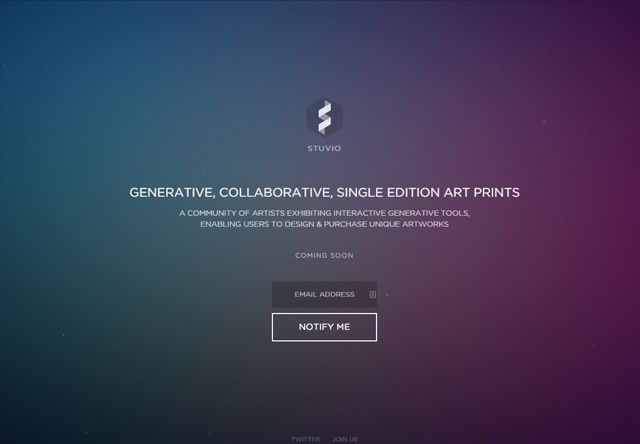
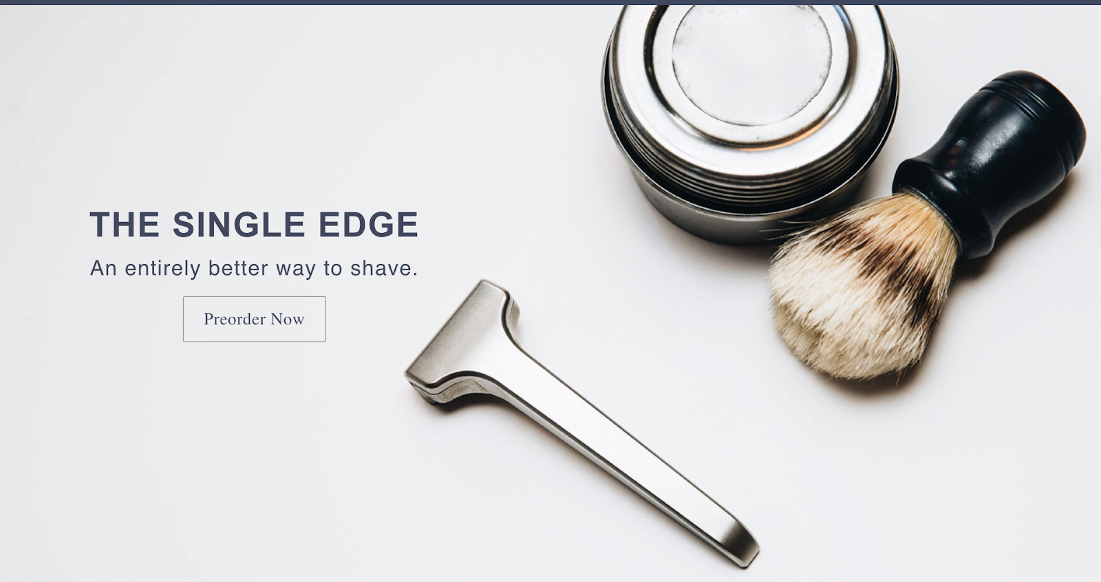
26. Supply
Supply’s coming soon page for their premium shaving products featured high-quality product photography showcasing their signature single-edge razor alongside traditional shaving accessories against a clean white background.
The page communicated their value proposition directly with “THE SINGLE EDGE” headline followed by “An entirely better way to shave.”
Their approach emphasized quality and craftsmanship through the professional product imagery, positioning their offering as a premium alternative to mainstream razors.
The “Preorder Now” call-to-action created urgency while suggesting limited availability, driving early sales before the official launch.
This combination of elegant visuals and straightforward messaging effectively communicated their position in the premium men’s grooming market.
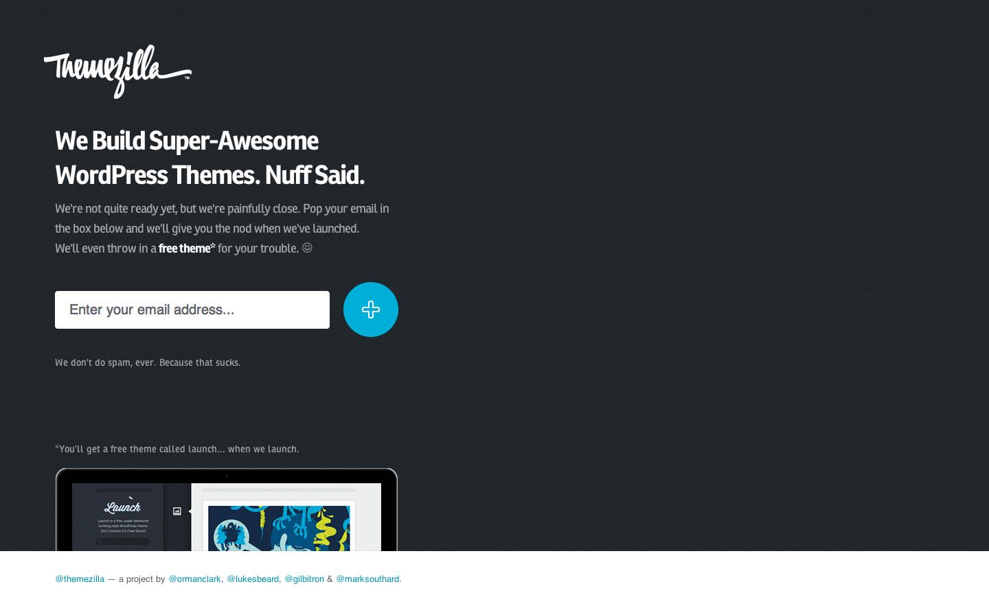
27. Themezilla
Themezilla’s coming soon page featured a bold dark background with their distinctive script logo prominently displayed, creating immediate brand recognition.
The page used conversational, personality-filled copy: “We Build Super-Awesome WordPress Themes. Nuff Said.” followed by friendly messaging about being “painfully close” to launch.
Their approach stood out by offering an immediate incentive—”a free theme for your trouble”—creating value for early subscribers before launch.
The email capture form featured a distinctive circular blue button that added visual interest.
The page included a preview of their flagship theme “Launch” at the bottom, demonstrating their design capabilities while building anticipation for their WordPress theme collection, effectively combining personality with product demonstration.
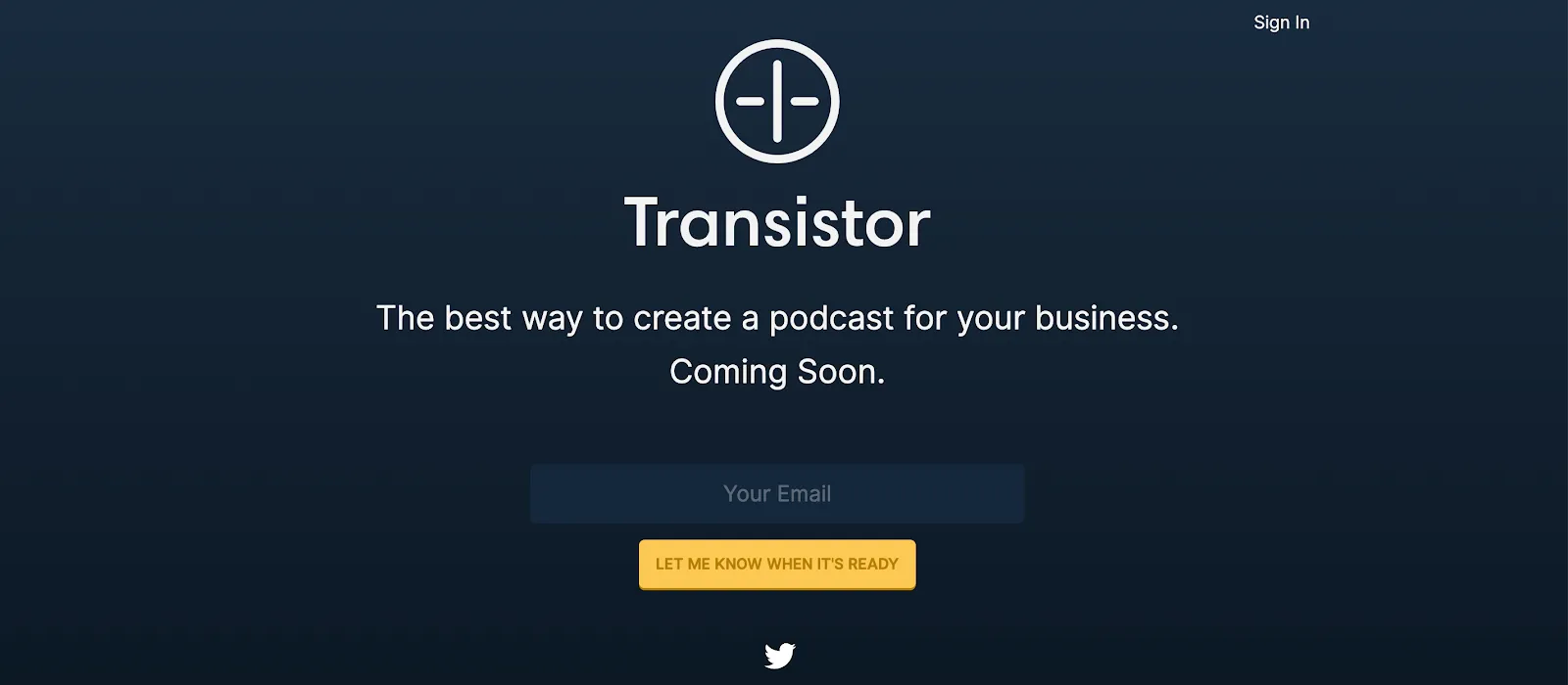
28. Transistor
Transistor’s coming soon page for their podcast hosting platform featured a deep navy background with their minimalist logo prominently displayed, creating a professional, focused aesthetic.
The page used clear, benefit-focused messaging with “The best way to create a podcast for your business. Coming Soon.” immediately communicating both their product purpose and target audience.
Their yellow “LET ME KNOW WHEN IT’S READY” button provided strong visual contrast against the dark background, driving attention to the call-to-action.
The simple, uncluttered design reflected the ease-of-use their platform promised, while the strategic use of color created a memorable brand identity.
This streamlined approach effectively generated interest from business-focused podcasters looking for specialized hosting solutions.
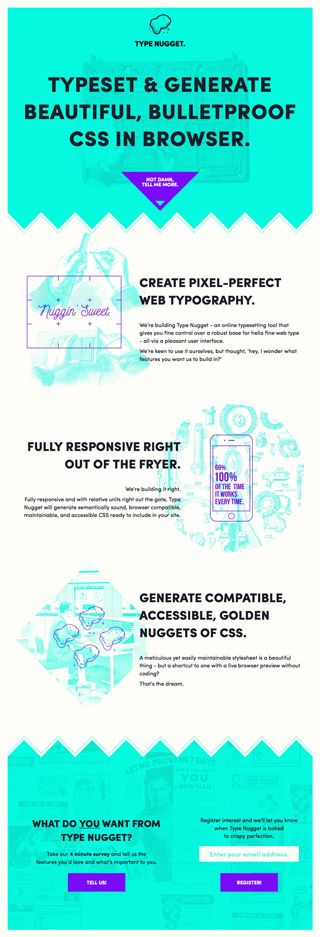
29. Typenugget
Typenugget’s coming soon page featured a vibrant teal background with playful illustrations that reflected the creative, design-focused nature of their CSS typography tool.
The page clearly communicated their value proposition with “TYPESET & GENERATE BEAUTIFUL, BULLETPROOF CSS IN BROWSER” immediately establishing their purpose.
Their approach effectively demonstrated the product’s capabilities through visual examples of web typography alongside explanatory text about responsive design and cross-browser compatibility.
The coming soon page concluded with a clear call-to-action asking “WHAT DO YOU WANT FROM TYPE NUGGET?” with options to either “TELL US” or “REGISTER,” creating engagement while collecting valuable pre-launch feedback.
This combination of product demonstration and user involvement generated qualified leads specifically interested in their web typography solution.
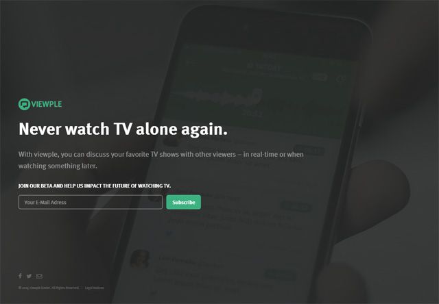
30. Viewple
Viewple’s coming soon page featured a dark, atmospheric background with a smartphone displaying their app interface, immediately communicating their mobile-first social TV platform.
The page used a compelling, benefit-focused headline: “Never watch TV alone again.” followed by a concise explanation of their unique functionality: “discuss your favorite TV shows with other viewers—in real-time or when watching something later.”
Their approach emphasized community building with the call-to-action “JOIN OUR BETA AND HELP US IMPACT THE FUTURE OF WATCHING TV,” making early adopters feel like valued contributors rather than just users.
The green “Subscribe” button provided strong visual contrast against the dark background, drawing attention to the conversion point while maintaining the immersive, entertainment-focused aesthetic.
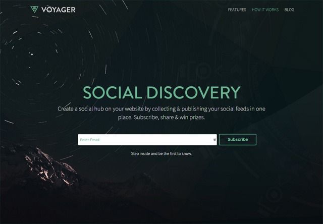
31. Voyager
Voyager’s coming soon page featured a dramatic space-themed background with star trails against a dark cosmos, creating an immediate sense of exploration that aligned with their brand name.
The page clearly communicated their value proposition with “SOCIAL DISCOVERY” followed by “Create a social hub on your website by collecting & publishing your social feeds in one place.
Subscribe, share & win prizes.” Their approach balanced information with incentives, offering both product clarity and reward motivation.
The email capture form featured the encouraging message “Step inside and be the first to know,” creating exclusivity.
Navigation options at the top for “FEATURES,” “HOW IT WORKS,” and “BLOG” provided additional engagement opportunities for interested visitors, effectively balancing simplicity with sufficient information about their social aggregation platform.
32. Duolingo
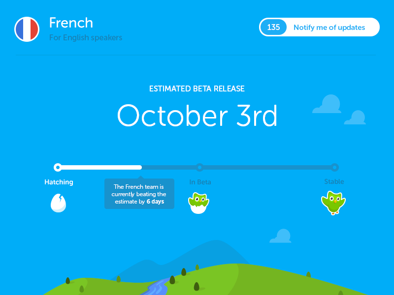
Duolingo’s coming soon page featured their iconic owl mascot against a vibrant blue background that captured the app’s playful, accessible approach to language learning.
The page utilized a progress indicator showing development stages from “Hatching” to “Stable,” with the French course shown as “In Beta” but “beating the estimate by 6 days.”
This clever visualization communicated both product status and the company’s commitment to exceeding expectations.
The “Notify me of updates” button prominently displayed “135” existing subscribers, creating social proof while encouraging more sign-ups.
This approach effectively built anticipation while demonstrating the product’s iterative development process, perfectly aligning with their educational mission.
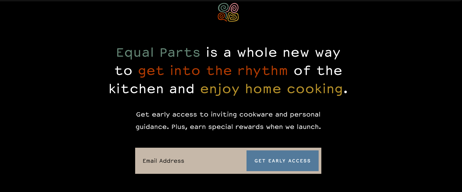
33. Equal Parts
Equal Parts’ coming soon page featured a sophisticated black background with colorful text highlighting their value proposition: “a whole new way to get into the rhythm of the kitchen and enjoy home cooking.”
The contrasting colored text drew attention to key benefits while maintaining a premium aesthetic.
Their approach emphasized both product and service elements with the message “Get early access to inviting cookware and personal guidance. Plus, earn special rewards when we launch.”
The email capture form used a neutral beige input field paired with a blue “GET EARLY ACCESS” button, creating visual hierarchy.
This combination of aspirational messaging and clear incentives effectively positioned their cookware brand as a lifestyle solution rather than just kitchen products.
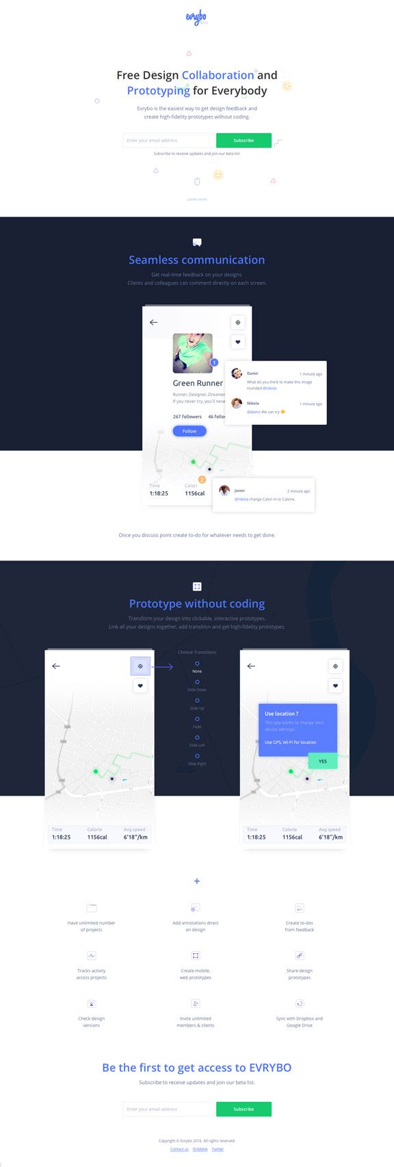
34. Evrybo
Evrybo’s coming soon page for their design collaboration platform featured a clean white top section transitioning to navy sections that showcased their product functionality.
The page clearly communicated their value proposition with “Free Design Collaboration and Prototyping for Everybody” followed by a concise explanation of their no-code approach to high-fidelity prototyping.
The scrolling experience demonstrated key features including “Seamless communication” and “Prototype without coding” with actual product screenshots showing the interface in action.
The repeated call to action “Be the first to get access to EVRYBO” with green “Subscribe” buttons throughout the page created multiple conversion opportunities.
This approach effectively showcased the product’s capabilities while generating qualified leads from design professionals seeking collaboration tools.
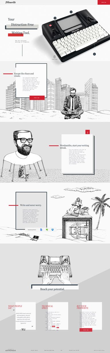
35. Freewrite
Freewrite’s coming soon page for their distraction-free writing device featured a clean white background with a high-quality product image showcasing their distinctive typewriter-inspired design.
The page clearly communicated their value proposition with “Your Distraction-Free Writing Tool” prominently displayed, immediately establishing their unique positioning in the market.
The scrolling experience included illustrated sections highlighting key benefits like “Escape the chaos and create” and “Write and never worry,” using a distinctive red accent color for emphasis.
The bottom section featured the powerful call to action “Reach your potential” alongside technical specifications and testimonials.
This comprehensive approach effectively demonstrated both the physical product and its emotional benefits for writers seeking focus, generating pre-launch interest from their target creative audience.
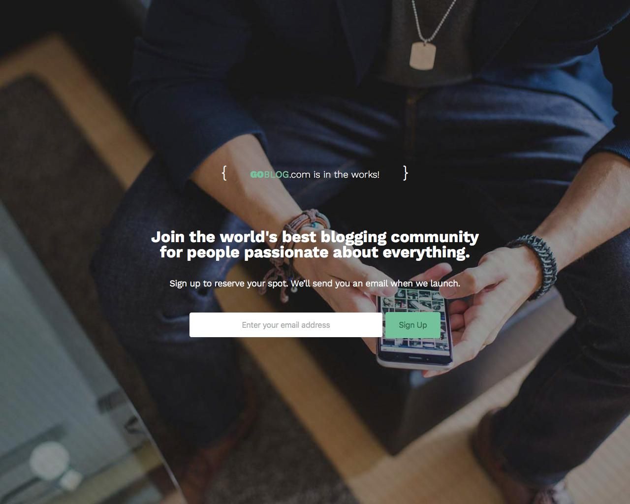
36. GoBlog
GoBlog’s coming soon page featured a lifestyle image of a person holding a smartphone displaying the app, creating an immediate visual connection to the product experience.
The minimalist design included code brackets around “GOBLOG.com is in the works!” suggesting their tech focus, while the headline “Join the world’s best blogging community for people passionate about everything” clearly communicated their ambitious value proposition.
The page used a straightforward approach with a simple email capture form and green “Sign Up” button, avoiding unnecessary distractions.
The conversational message “Sign up to reserve your spot. We’ll send you an email when we launch” created both exclusivity and clarity about next steps.
This human-centered approach effectively positioned their platform as a community rather than just a blogging tool.
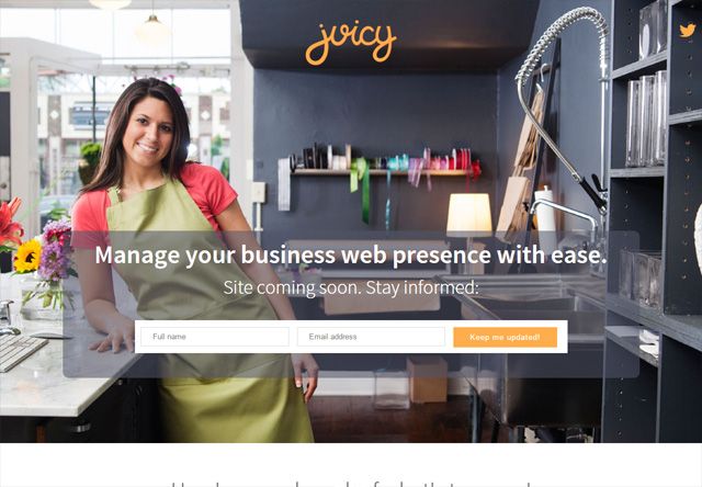
37. Juicy
Juicy’s coming soon page for their business web presence management platform featured a warm, inviting image of a woman in a professional workshop setting, immediately establishing a small business focus.
The semi-transparent overlay presented their clear value proposition: “Manage your business web presence with ease” alongside the “Site coming soon.
Stay informed” message that created anticipation without overpromising. Their form requested both name and email with an orange “Keep me updated” button providing strong visual contrast.
The professional yet approachable design aligned perfectly with their target audience of small biz owners seeking simplicity in their digital presence.
This personalized approach with a real person rather than abstract graphics helped potential users envision themselves using the service.
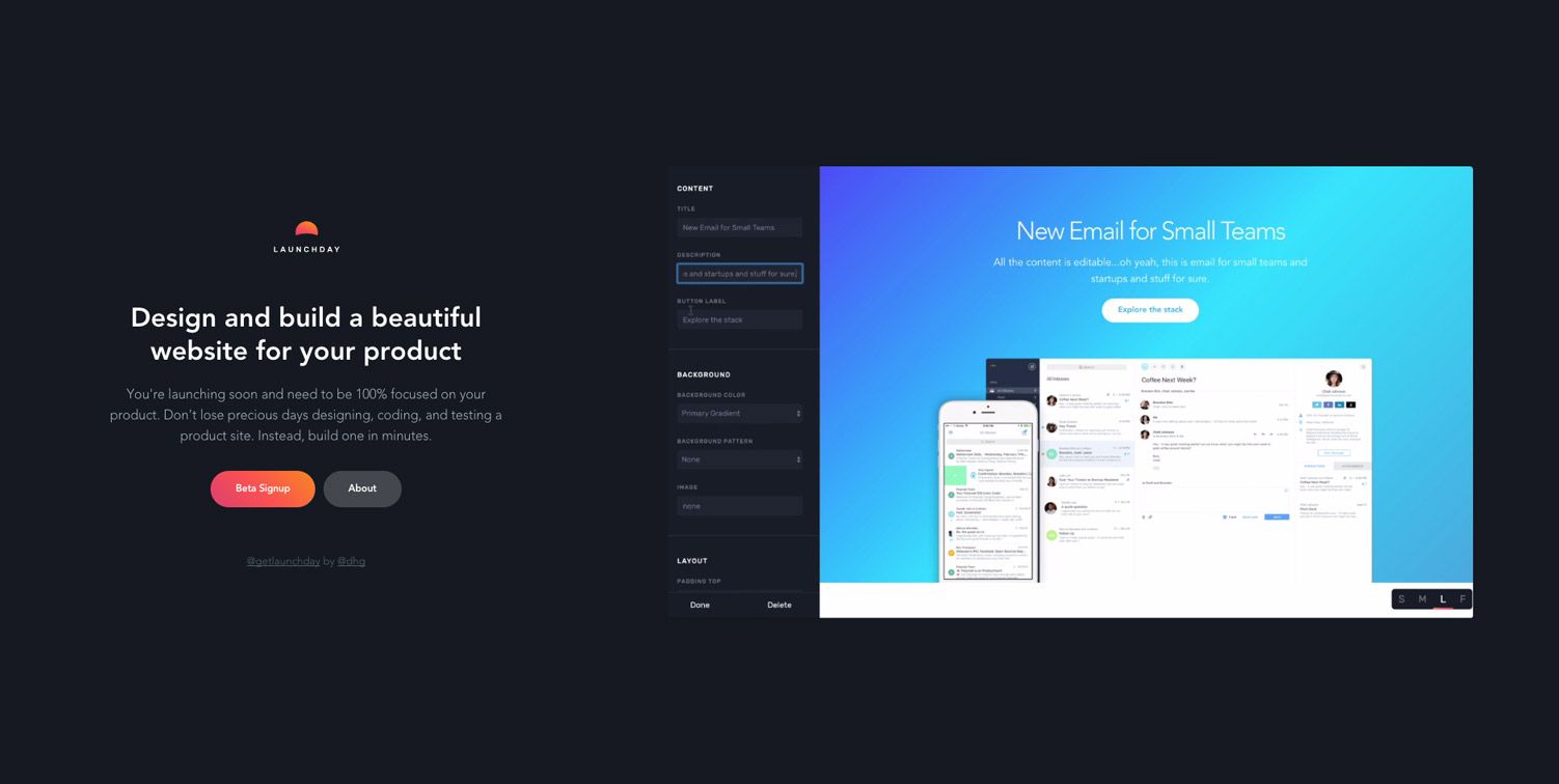
38. Launchday
Launchday’s coming soon page showcased their meta approach—a tool for building coming soon pages displayed on a coming soon page itself.
The dark interface featured their product interface on the right showing an email template builder, immediately demonstrating functionality.
Their messaging “Design and build a beautiful website for your product” followed by “You’re launching soon and need to be 100% focused on your product” spoke directly to time-constrained founders.
The coral “Beta Signup” button provided strong visual contrast against the dark background, while the “About” option offered additional information without leaving the page.
The self-referential nature of showing their actual product in use effectively proved their expertise in the pre-launch page space, building credibility through demonstration rather than promises.
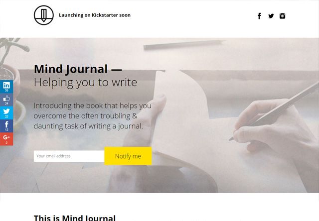
39. Mindjournal
Mindjournal’s coming soon page for their journaling product featured a calming, neutral background with a person writing, immediately visualizing the product’s purpose.
The clear headline “Mind Journal — Helping you to write” followed by “Introducing the book that helps you overcome the often troubling & daunting task of writing a journal” succinctly communicated both their value proposition and target audience.
The bright yellow “Notify me” button created strong visual contrast for conversion, while social sharing icons on the left encouraged visitors to spread the word.
The “Launching on Kickstarter soon” text established their funding approach while creating time-sensitivity.
The professional photography and clean typography positioned the product as a premium solution for mental wellbeing through structured journaling, appealing to those seeking personal growth tools.
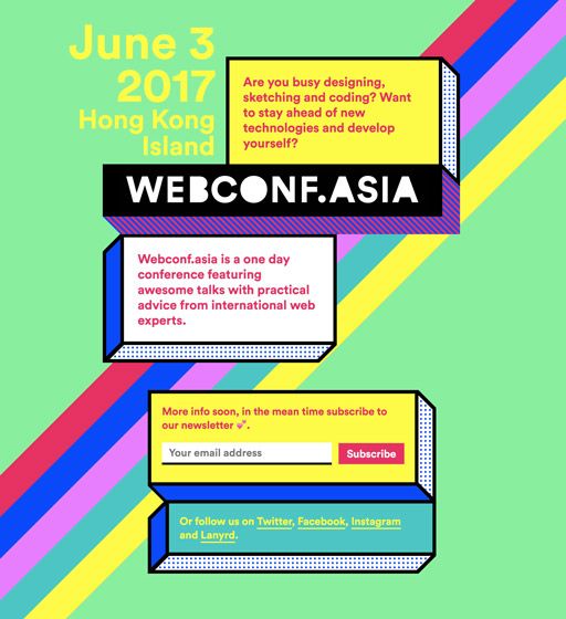
40. Webconf.asia
Webconf.asia’s coming soon page featured a vibrant, colorful design with geometric elements that reflected the creative, tech-focused nature of their web development conference.
The page used a distinctive Memphis-style design with bright colors and patterns against a lime green background, immediately establishing a memorable visual identity.
Their approach provided essential information upfront, including the event date “June 3, 2017” and location “Hong Kong Island,” alongside a value proposition targeting their audience: “Are you busy designing, sketching and coding? Want to stay ahead of new technologies and develop yourself?”
The page explained the conference format while encouraging email submission form with a bright pink “Subscribe” button. This combination of clear event details and energetic design effectively caught the interest of their target audience of web professionals in Asia.
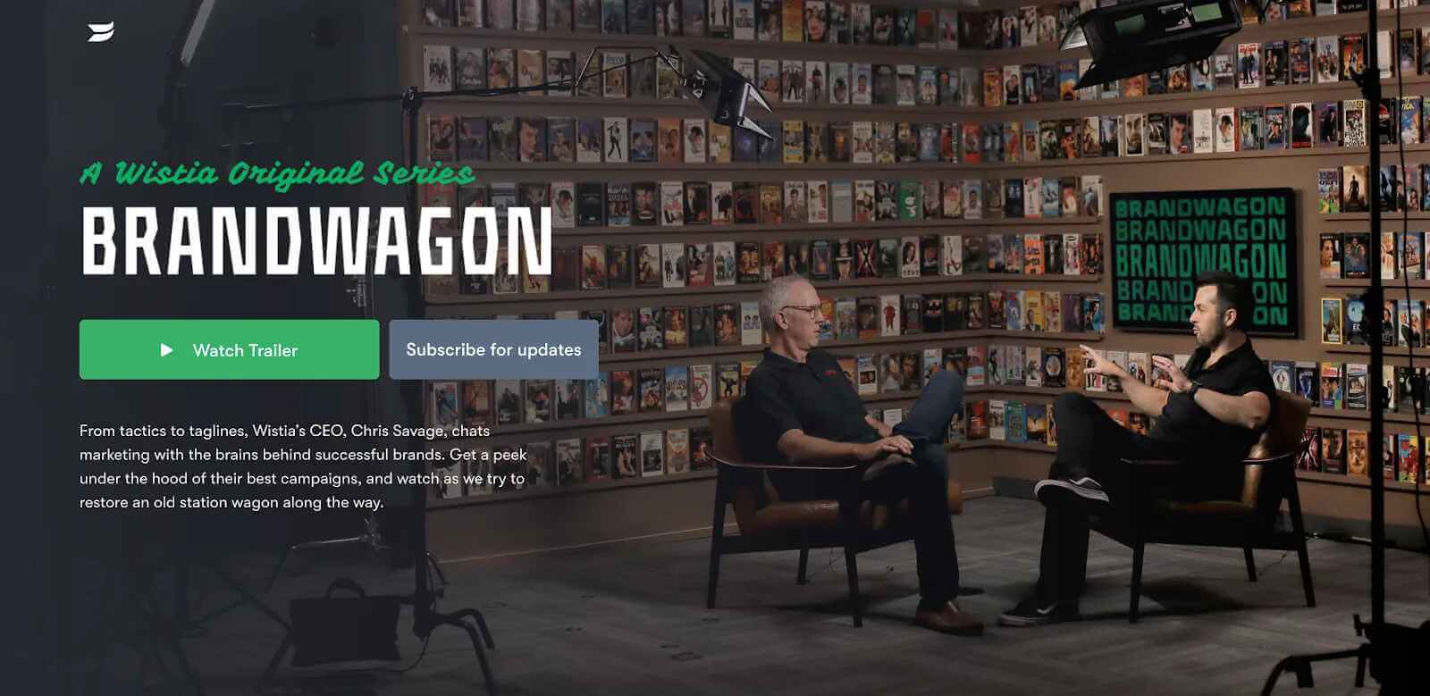
41. Wistia Brandwagon
Wistia Brandwagon’s coming soon page for their original video series used a cinematic approach, showcasing the actual set with hosts in conversation against a backdrop of vintage VHS tapes.
The page immediately established production quality while the “A Wistia Original Series” text positioned it as premium content.
Their approach emphasized video with a prominent green “Watch Trailer” button alongside a more subdued “Subscribe for updates” option, providing multiple engagement paths.
The descriptive text explained the concept: “From tactics to taglines, Wistia’s CEO, Chris Savage, chats marketing with the brains behind successful brands.”
This combination of visual storytelling and clear value proposition effectively generated interest from marketing professionals seeking industry insights, while the VHS aesthetic created a nostalgic yet distinctive brand identity for their video marketing series.
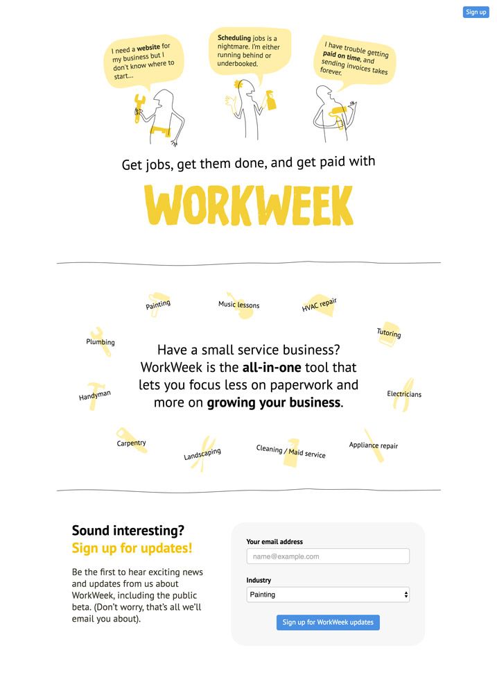
42. Workweek
Workweek’s coming soon page for their small business management platform featured a clean, illustration-driven design with a bright yellow color that conveyed optimism and approachability.
The page used speech bubble illustrations showing common business owner pain points: “I need a website for my business but don’t know where to start,” “Scheduling jobs is a nightmare,” and “I have trouble getting paid on time,” immediately connecting with their target audience’s challenges.
Their clear value proposition “Get jobs, get them done, and get paid with WORKWEEK” was followed by service categories in yellow tags, showing versatility across industries like plumbing, painting, and tutoring.
The signup form requested both email and industry selection, allowing for personalized follow-up.
This problem-solution approach effectively resonated with service business owners while collecting valuable segmentation data for their launch.
Essential Tools to Build Your Coming Soon Landing Page
Creating effective coming-soon pages requires the right tools (as always).
While great examples might look complex, modern solutions make building a professional pre-launch page possible without technical expertise. These tools connect seamlessly with the strategies we’ve examined in the previous examples.
1. Landing Page Builders
Landing page builders offer the fastest route to creating a professional coming-soon page. These platforms provide drag and drop functionality that makes design intuitive and accessible.
- Leadpages stands out for its coming-soon template library and optimization features.
Their templates are specifically designed to convert visitors, with strategic placement of signup forms and calls to action. The platform provides A/B testing capabilities to fine-tune your landing page performance.
- Unbounce provides more design flexibility through its powerful editor.
The platform excels at creating mobile-responsive designs that look perfect across all devices, similar to the responsiveness seen in the Freetrade example above.
- Instapage focuses on conversion optimization with advanced analytics.
Their heat mapping tools reveal how visitors interact with your coming-soon page, allowing you to place key elements where they’ll generate maximum engagement.
While potentially more expensive for single-page use, the insights gained can significantly improve conversion rates.
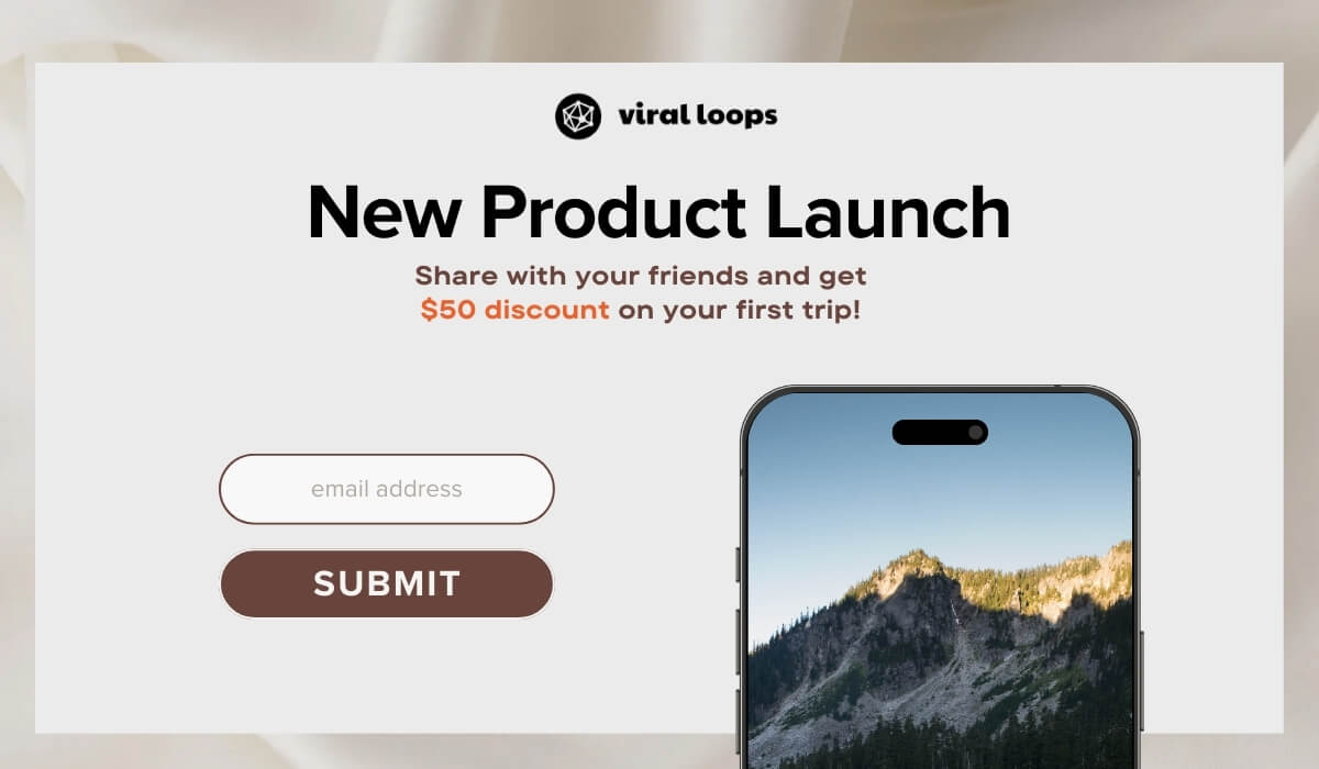
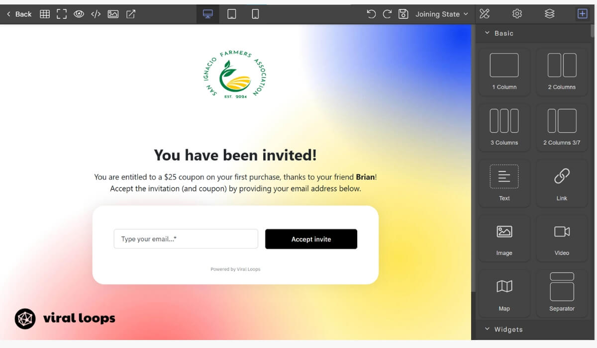
- Viral Loops is a referral program software that also has a landing page builder and editor.
If you’re implementing a referral program during your launch, using just one tool for multiple functions would allow you to streamline your work and even save money!
Click here to try it for free.
2. Content Management Systems
Content management systems offer greater flexibility for businesses planning to expand beyond a simple coming-soon landing page.
- WordPress remains the most popular option, with numerous plugins dedicated to creating pre-launch pages.
- Solutions like SeedProd allow you to create a coming-soon mode while building your main site behind the scenes.
This approach provides seamless transition from pre-launch to full website on launch day.
- Webflow combines design freedom with robust CMS capabilities.
Their visual editor allows precise control over every aspect of your coming-soon page design while building on a platform that can grow with your business.
Webflow also offers hosting, eliminating the need for separate hosting services.
These options allow you to maintain the same domain for your coming-soon page and full website, preserving any SEO benefits gained during the pre-launch phase.
This continuity proves valuable for businesses focused on long-term digital presence.
3. Email Marketing Platforms
Email marketing platforms connect the lead capture on your coming-soon page with nurturing campaigns that maintain engagement until launch.
- Mailchimp offers beginner-friendly tools with substantial free tiers perfect for pre-launch campaigns.
Their automation features allow you to send a sequence of messages introducing your concept and building anticipation, similar to how Mint maintained interest before their launch.
- Active Campaign provides more sophisticated segmentation and automation capabilities.
This platform excels at nurturing leads based on their specific behaviors and interests, allowing personalized communication with different audience segments.
Their CRM features help track prospect engagement throughout the pre-launch period.
- ConvertKit specializes in creator-focused features ideal for small business owners and small teams.
Their visual automation builder makes it simple to design email sequences that maintain engagement with waiting list members. Their forms integrate seamlessly with most landing page tools, ensuring smooth data collection.
All these platforms offer analytics to track open rates, click-through rates, and overall campaign performance—metrics that are essential for optimizing your pre-launch communication strategy.
4. Referral Marketing Software
Referral marketing software can transform your coming-soon page from a passive collection tool into a viral growth engine, as demonstrated by Robinhood and Harry’s success.
Viral Loops specializes in pre-launch campaigns with templates inspired by successful launches. This platform tracks referrals automatically, assigning proper credit and rewards to participants.
The analytics dashboard shows how your campaign spreads, identifying your most valuable advocates.
This referral program software makes implementing sophisticated referral systems simple by allowing you to integrate them to your coming-soon pages.
Companies can create tiered reward structures, priority access, and special incentives for top referrers without coding knowledge.
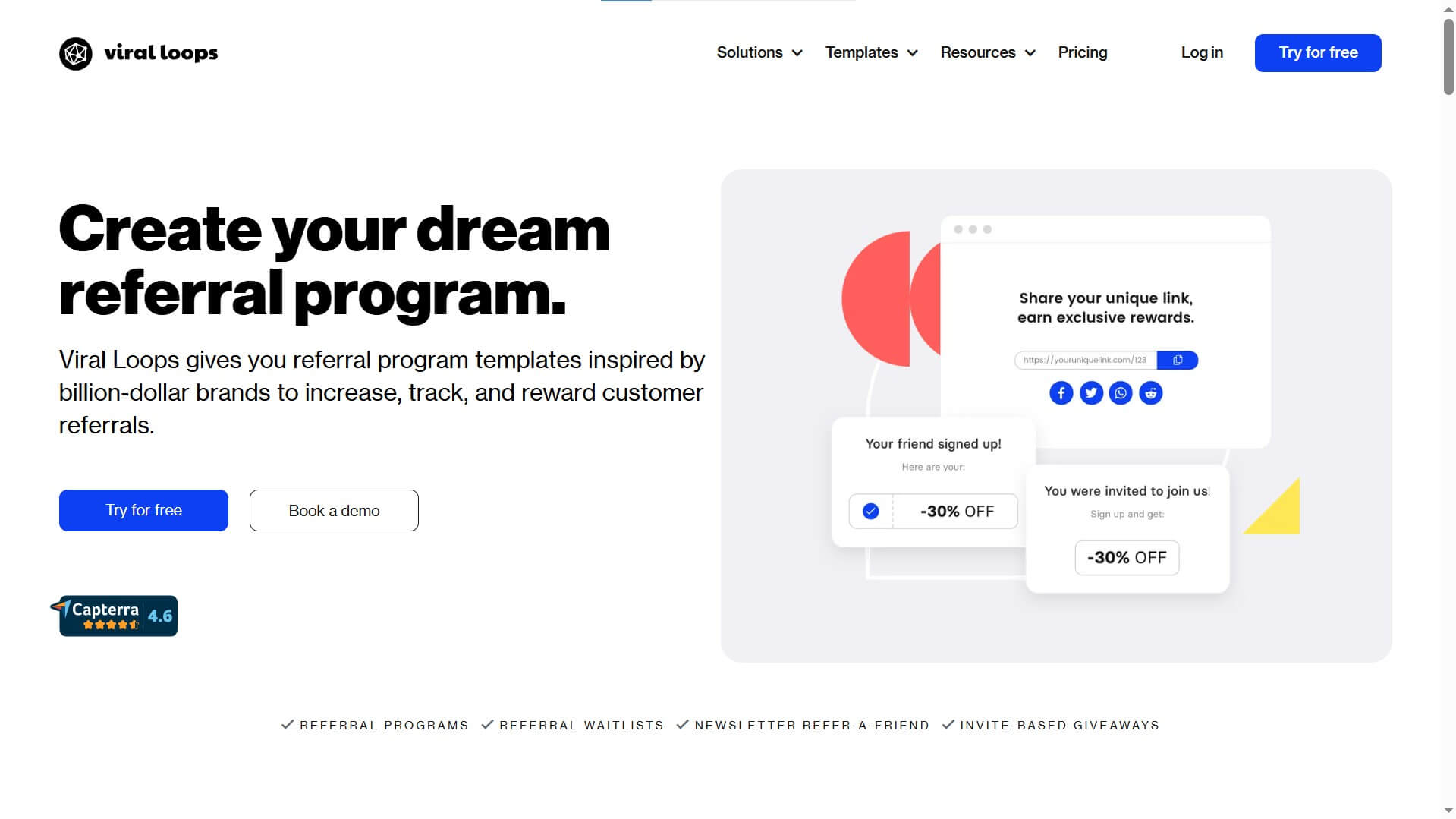
It’s very easy to use, too! But if you still need some guidance on how to use it, you can always book a free demo today.
Final Word: Transform Your Launch with a Strategic Coming-Soon Page
A coming soon landing page is more than just a placeholder—it’s an opportunity to build relationships with potential customers before your product is even available.
By implementing the strategies we’ve covered, you can transform your launch from a quiet beginning to a momentum-filled event.
The most successful coming-soon campaigns share common elements: they communicate clear value, create a sense of anticipation, and make joining early feel special.
Whether you’re launching a new site, opening an online store, or releasing a SaaS product, these principles apply universally.
Remember to keep testing and optimizing your page based on real data. What works for one audience might not work for another, so be prepared to adapt your approach based on the metrics you collect.
Finally, view your coming-soon page as the first step in your customer relationship, not just a marketing tactic.
The impression you make now will set the tone for how people perceive your brand long after you’ve launched.
Make it count with professional design, compelling messaging, and thoughtful follow-up that turns early interest into lasting loyalty.