After putting thousands of hours into developing a new product, it’s only normal that you would want to see it go viral and have people coming in droves to buy it.
But here’s the challenge: in the business world, there are millions of brands competing for consumers’ attention.
So, what can you do to set yourself apart?
There are several options available, but what you want is to get consumers searching for you instead of the other way around.
You can do that by creating suspense around your new product as it gets potential customers hyped up about it.
What is an effective way to create suspense?
By creating pre-launch landing pages!
In this guide, we will talk about:
- What pre-launch landing pages are
- Tips to help you create them
- How you can build landing pages
Let’s go!
Table of Contents
What is a Pre-Launch Landing Page?
10 Tips with Examples to Create a Great Pre-Launch Landing Page
How Can I Build a Pre-Launch Landing Page?
What is a Pre-Launch Landing Page?
A pre-launch page (also referred to as a ‘coming soon’ landing page) is a detailed page on your website where you can direct people to get more information about your upcoming product.
Sounds pretty simple, right?
This ‘coming soon’ landing page is where you get to convince potential customers why they should be interested in your product or service.
How do you convince them?
You can use images, videos, copy, and giveaways among others.
It is a good way to show your customers what they will be missing out on if they don’t stay in the loop about your product, or if they don’t buy it!
Concerning the copy, you want to focus on the value your target audience will gain from the product in simple words.
Up next, let’s talk about tips to help you create an eye-catching page right before your product launch.
10 Tips to Create a Great Pre-Launch Landing Page
You can think of landing pages as runways for models in fashion contests where brands get to advertise their latest designs.
However, instead of clothes, you are showcasing your newest product(s).
You need your landing page to be spectacular and appealing enough to get people to engage with it (such as by signing up for more information or joining a waiting email list for the product’s release).
So, how do you get to make that happen?
First, you need to…
Tip #1: Have a clear value proposition
A value proposition answers the question: why should consumers choose your product?
A value proposition summarizes the key benefits by addressing your customer’s pain point.
It’s sometimes used interchangeably with unique selling points (USP), but they’re quite different.
USPs show what’s unique about your product while value propositions seek to build on the benefits your product or brand offers customers.
Why is having a clear value proposition important?
First, it gives your page direction. People who visit your page will know what’s in it for them.
Having a value proposition helps you connect with your audience on a deeper level as you will get to create a landing page that speaks to and suits them.
Let’s just show you what we mean using this landing page example page from PandaDoc.
Their value proposition in this case is “Send Documents Like a Pro”.
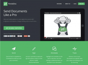
Image Source: Panda Doc
This landing page belongs to Panda Docs and they do a great job stating what value they have to offer their audience.
Essentially, anyone who sees the page knows what the product is (and what it lets them do).
That’s why you need a value proposition.
The page goes on to talk about other features of the product such as signing digital documents, annotations, and tracking them.
They also included social sharing buttons (more on that later) on their page so users can share the page and subsequent information with their friends.
Tip #2: Use a clear call- to-action (CTA)
CTA is a term that’s thrown around the marketing space a lot, but what does it mean and why is it important for your pre-launch web page?
A call-to-action is a cue on your landing page that informs potential customers what steps they should take next.
It’s usually a command word or phrase with a touch of gentility, taking visitors from just surfing your page to making decisions.
In other words, CTAs help you get the kind of results you want during your pre-launch campaign as potential customers are able to take action.
So, the content reflects your value proposition and when your audience has seen what your product can offer them, and then the CTA converts them.
Some common CTAs include:
- Download your free ebook
- Buy now
- Try for free
- Claim your early bird discount
- Get priority access
Here’s a example:
It tells potential users what to expect when they hit the button. If you look closely at the button you will see it has a distinctive color that makes it easy to identify.
More importantly, it shows users what they have to do, which is input their email addresses.
Tip #3: State your product’s benefits
Another crucial tip that should be considered when creating your pre-launch landing page is to indicate what benefits your product has to offer.
We know what you’re thinking…
You’ve been speaking about highlighting the product’s features; aren’t they the same thing?
We anticipated this, so here’s where they differ:
Features describe the technical part of your product while benefits refer to why the features are important to your customers.
Essentially, features tell you what the product is and benefits tell you why it matters.
Why should you include benefits on your landing page?
First off, your audience may not always understand what the features are and why they should care. Stating the benefits helps them understand what they’ll be getting.
Secondly, spelling out the benefits of your products lets people know if you hold the solution to their problem.
The Everest app showed this clearly on its pre-launch landing page. The benefits of their app included the following as seen in the screenshot below:
- Focus on what matters
- Keep taking the next step
- Beautifully capture your journey
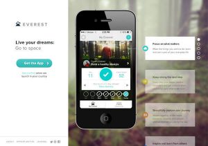
Visitors can read up on what they will gain from the app and with a clear CTA, can easily download the app (and know that’s the direction they should go).
Tip #4: Clearly describe what the product is about
Next, it’s important you precisely describe what your product is about.
But, you just said consumers may not understand features, right?
While it may sound very similar, describing the product is different and helps users better understand the product.
The goal of the description is to get people to feel more confident about what they’re getting into.
It doesn’t have to be a whitepaper, the description can be brief. It’s like a sneak peek—just enough to establish brand awareness.
You can take a look at how Composer described their product on their pre-launch landing page.
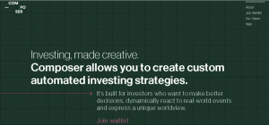
Image Source: Composer
From the screenshot above you can see how briefly they described what their marketplace is about.
It was concise and detailed, which showed users what to expect in an easily digestible manner that would speak to them.
Tip #5: Use engaging images and graphics
A great page design helps potential customers see value in your product more quickly and clearly.
As such, you need to have an image or graphic that can capture people’s attention.
Images that fall in this category are referred to as ‘hero’ images.
You’d agree that as a consumer, it’s pretty easy to keep scrolling through different sites or social media platforms until a web design or something fascinating catches your eye.
So, how do you grab people’s attention?
You can use copy, but having an accompanying engaging image will allow people to see what value is in it for them.
Why is this even important?
You get to showcase the benefits and value of your product in a very compelling way.
Arche Travel’s landing page is a good example of how engaging images and graphics can be used during your pre-launch marketing campaign.
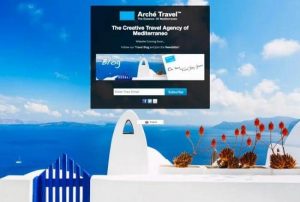
Image Source: Arché Travel
The image (beautiful holiday destination) they used gave people a hint of what their site was about.
It was quite appealing and the call-to-action and value proposition made it even better.
Tip #6: Try not to overwhelm the user
As much as you want to clearly outline the features and benefits of your product, it’s important you do it with brevity.
There should be bullet points with very short descriptions.
Why?
The human attention span is now shorter than ever – just 8 seconds, which is less than that of a goldfish!
In other words, whatever message you want on your landing page needs to be on point and succinct enough to let people know what the page is about.
If it’s not, they might get overwhelmed and leave, even if your content is interesting.
Beseda’s pre-launch landing page is a good example of how you can avoid overwhelming customers.
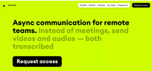
Image Source: Baseda
The virtual meeting app provided users with only important information in a simple way.
They described what Baseda is about, included a header, its main feature, and a clear CTA.
That’s what a compelling landing page should look like.
…and you can make yours a little better with engaging images and graphics that will capture and hold your customers’ attention.
Tip #7: Use social media sharing buttons
We fulfilled our promise!
Social media sharing buttons are buttons for various social sites such as Twitter, Facebook, Instagram, and more that you can add to your website.
They allow page visitors to share your content with their friends, family, or online community.
These buttons can be a form of free promotion for your digital products or eCommerce store.
The more your audience shares, the more reach you’ll get.
In other words, it’s great for lead generation.
However, you need to keep in mind that your offer or product description has to be good enough for them to share.
See how Optania used them on their landing page in the screenshot below.
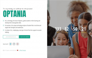
Image Source: Optania
They also use a countdown timer which we will talk about in the next section.
Tip #8: Use a countdown timer
A countdown timer is a virtual clock that has been set to count down from the date the page is viewed to a particular date and time for when a product will be available for purchase, pre-orders, or when an event begins.
You can use a timer to add more value to your product.
Its purpose is to get people feeling like they need to jump on your offer quickly.
With a countdown clock, people are inclined to take action quickly because they’re afraid of missing out. It helps build anticipation.
This feature leverages the fear of missing out (FOMO) which means it can help increase your conversion rate, a main component of any successful campaign or product launch.
The prelaunch landing page below is a great example of how you can use a countdown timer.
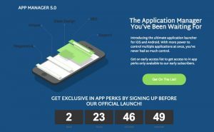
It’s located just below the CTA button with a direct message of what users would benefit from coming onboard, such as “Receive exclusive in-app perks by getting early access.”
The landing page almost incorporates everything we’ve talked about so far – image, CTA, product benefits, and description.
Tip #9: Don’t ask for too much information
If you want to capture leads, you should limit your requests to just one piece of contact information if you can; email addresses for a mailing list is enough.
Why?
Well, the limited human attention span is one reason. Another reason is fewer information aids more conversion.
Asking for their names, gender, age, and whatnot is good, but that means more work for them when filling out the sign-up form.
As a result, they may be more likely to leave your page.
Make your landing page simple, classy, and engaging by requesting only their email.

In fact, you really only need to collect email addresses to launch an email marketing campaign.
That’s the only thing this page example above requests (and that’s how most landing pages operate).
You can see other compelling elements that we’ve spoken about, too, such as social media sharing buttons, copy, and a CTA.
Tip #10: Use video (when it makes sense)
Adding videos to your landing page makes it more engaging and shows your product in the best light.
Why?
People like to see social proof.
With videos, users get to see what your product can offer them in a real-world example, which can help build hype before the actual product launch date.
What’s more is that using videos limits the amount of written content on the page and allows users to focus more on the product.
Using videos is great for some products, but it’s advisable to only use them when it makes the most sense, and also ensure that it doesn’t draw the user’s attention away from the CTA or similar crucial elements on your landing page.
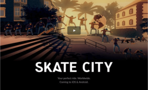
Image Source: Skate City
This Skate City’s landing page is an example of when it makes sense to use videos.
The video game makers go ahead to inform people where they can play it (iOS and Android).
How Can I Build a Pre-Launch Landing Page?
We’re pretty confident that this question has been on your mind since you started reading the previous section…
…and we’re here for it!
Building a pre-launch landing page is pretty straightforward with Viral Loops.
One way is to make use of the landing page templates available on our platform.
Specifically, a startup pre-launch template.
Here, you don’t require any coding language, just drag and drop.
This automation makes it easy for you to get people to join your waitlist.
Author’s Note: Plus, with our latest feature Viral Loops Rewards, all accounts are fully equipped to connect and send actual rewards. Through our latest integrations with Stripe and Tremendous, sending out gifts takes no time. This makes the process for creating your next product launch a breeze!
Make sure to check our chapter on Referral Rewards and Incentives for a deeper understanding of this subject.
You can create your page with our landing page builder in a short time using this template and there are more from where it came from.
It’s also possible to create the landing page in WordPress. We’ve got more information about that in the link above.
But can my developer do this?
Yes, you can get your developer to build the pre-launch landing page for you or hire an agency with experience.
However, keep in mind that these other options may not come with features such as fraud detection and responsive widgets, as adding them can be expensive.
The time has come for us to wrap this up!
Now Over to You
We’ve done our part in showing you what pre-launch landing pages mean including different tips on what to keep in mind before launch day.
You’ve also seen how you can build one.
Now, the ball is in your court.
But, if this all is uncharted territory for you, feel free to book a demo session with us and try Viral Loops for free.
There’ll be help for you at every step of the way.
We await to see the magic you’ll create. Thanks for reading!