Referral programs are pretty effective as they keep clients connected with your brand while you’re working to bring in new business.
So it’s an excellent option for anyone looking to keep their business going!
However, some referral programs don’t perform as effectively as they should.
After all, when a referral program grows in size, it can become confusing and hard to follow.
Fortunately, managing a referral program becomes more straightforward if you have a strategy.
So, do you need a template or checklist to help your referral program go in the correct direction?
You’re in the right place, so let’s get started.
An effective referral program aims to turn satisfied consumers into brand evangelists.
Your customers sign up for your referral program and get a unique code or link to share with their connections.
Your referral program software tracks the activity of a customer’s code or link.
Then, the referrer is rewarded every time someone uses it to make a purchase.
Consequently, this process allows your most loyal customers to do the talking, which can be considerably more successful than spreading the word yourself.
So, when people start praising your business, you get the immediate confidence boost that new customers bring and you also watch your conversion rates skyrocket.
You need a referral program template that enables you to provide clients with unique, gratifying experiences on their path to brand advocacy.
To do that, you must include the following parts in your template.
When your customers or referral prospects click on your “refer a friend” link or referral invite, the first thing they’ll see is the headline of your referral program.
So make it count by writing a title that catches your audience’s attention and entices them to continue reading.
Here are some pointers to help you pull it off.
Keep it short and to the point, as customers will click away if your title is too unclear or difficult to understand.
Make sure to describe the advantages because people only click a “refer a friend” link to see what’s in it for them.
So, tell them clearly what’s on offer and they’ll be more inclined to continue reading.
Your supporting headline functions as an extension of your headline.
Make it count by adding details that complement the primary headline and generate additional intrigue.
Also, you can use the supporting headline to clearly and concisely define your offer.
If you can, create a headline that reminds clients why they purchased from you in the first place.
Why? Because it gives them an extra incentive to share their experience with others.
It’s an excellent approach to capitalize on consumers’ need for social currency, boosting the possibility of recommendations.
Even more than persuasive text, imagery has the power to captivate readers.
The correct images capture and retain your consumers’ attention and provide them with the relevant context they need to comprehend better and remember your referral program.
We recommend you keep it simple for clients to follow along, by using icons or symbols to describe the processes in your referral program.
Moreover, to emphasize options and steps, use contrasting colors to give them an extra highlight.
You’ve captured the interest of your clients and explained the advantages.
But they probably want additional information before moving further.
How do they get such benefits? What are the guidelines?
Therefore, give them a detailed explanation of how to participate in your referral program.
A consumer is given a referral code or link as soon as they join a referral program, which serves as a unique identification.
Typically, it appears as a mix of letters, numbers, and symbols.
There are a variety of uses for a referral code or link, including:
The goal of a call to action (CTA) is to persuade your readers to take action.
Make sure your CTA speaks to their unique demands if you want them to take action.
So, make sure that every component on the page supports your CTA.
Moreover, your prospects will be confused if your message is inconsistent across all platforms where your CTA is shown.
The following are some CTA examples that indicate relevance:
After clicking a referral link, a person is sent to a referral landing page (usually an email, a social media platform post, or a website menu link).
Customers who arrive at your landing page want to know more.
Also, landing pages allow you to describe your referral program in more depth, including why consumers should join, program regulations, and other critical information.
Yet the landing page is one of the most underestimated aspects of a referral program.
You have thoroughly considered every facet of your referral campaign; you must now choose how you will fully reveal its benefits.
You may wonder what elements are required for a successful landing page overhaul.
Moreover, you must create the program’s appearance after you have determined the program’s details.
To create an engaging landing page, follow these tips:
Include several lines on the requirements, the many kinds of awards, and the total value you provide to advocates and referrals.
You’ll need one major picture to wow and illustrate the goal of the landing page.
Use this one picture to communicate a story or elicit a particular emotion (happiness or excitement are good things to aim for).
This graphic will express what words cannot; you can incorporate additional images, but don’t let it get too crowded.
Consider the following:
Allow your photographs to speak for you.
For example, if you own a bakery business, you may not want to use a burger as your landing page’s hero picture.
Avoid it until you can make it relevant to you in some way.
A ‘hero image’ is a website design phrase that refers to a large banner picture that appears at the top of a website.
Because of its prominent location at the top of a homepage, where it typically stretches full-width, it serves as a user’s initial view of your brand and service.
This picture must draw attention to itself; you’ll do fine if you combine a terrific, clear, relevant image with a great headline.
You should make your referral landing page as straightforward as possible.
Avoid cramming too much information into this area.
The goal here is to encourage users to click on the CTA button or fill out a form, not to read an article.
We will showcase some examples of referral program landing pages below that highlight this aspect.
Overall, ensure the user understands the objective of any graphics, language, or CTAs you use.
You want the user to be confident in their selection while avoiding inadvertent clicks.
Many of these criteria will also apply to your referral message (which can also be a landing page in your program).
Consider the following:

Image Source: Coursera
The referral page is quite simple and has a clear message. It also shows how the program works and has a clear CTA button informing the user what will happen after clicking.
Additionally, this incentive is fantastic (give a free course, get a free course).
Unlike others, Coursera leverages its referral program to get its product in front of more individuals, making for a successful referral program.
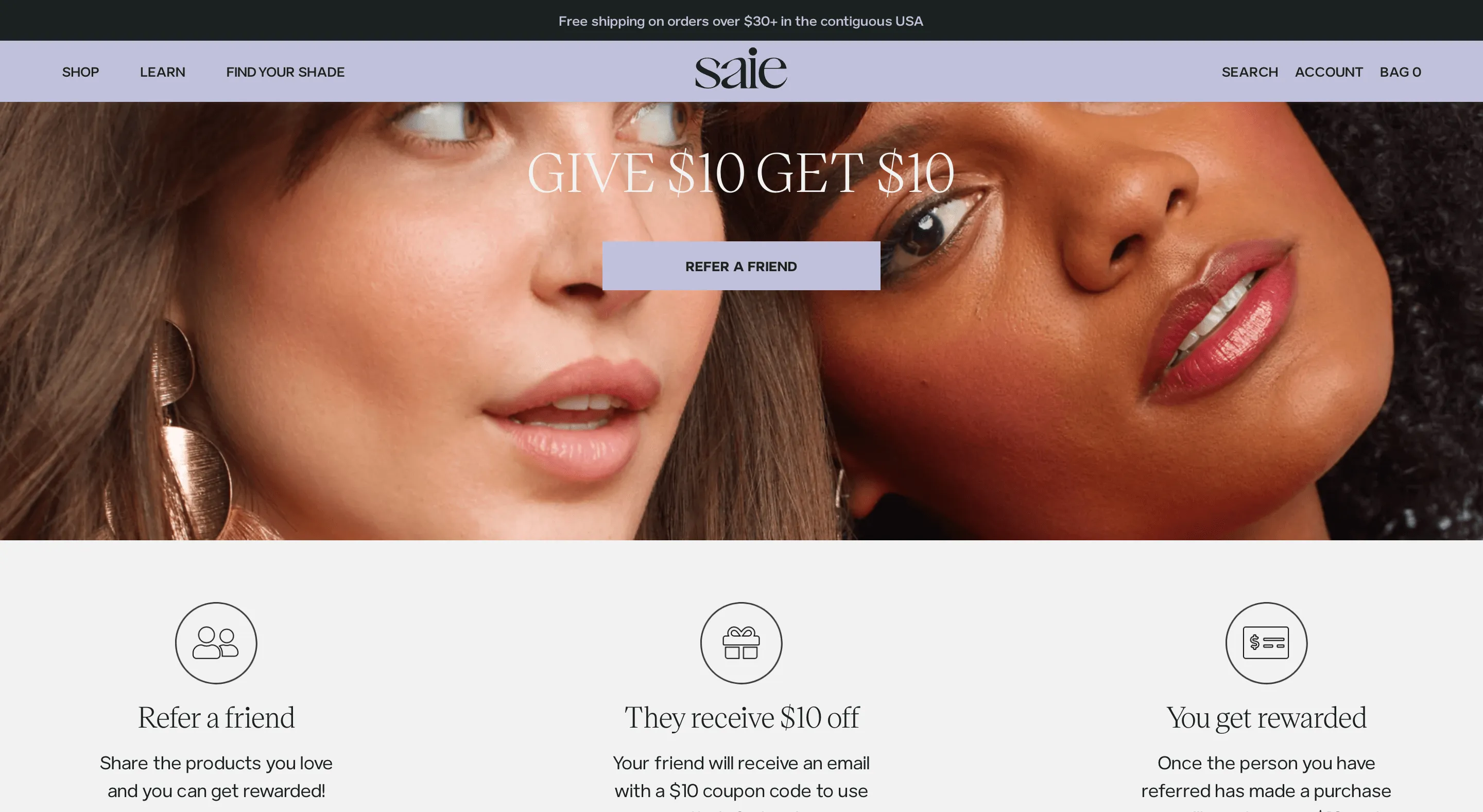
Image Source: Saie
Saie’s referral program page is minimalistic, and every element is shown clearly.
Also, a fascinating backdrop picture with human faces is used to evoke emotion.
The company defines what the user will provide and what the user will get, as well as how the whole referral process works, using just three icons.
Moreover, there’s a clear CTA button (refer a friend) with a distinct color that stands out from the rest of the backdrop and design.
The most successful firms today understand how to use social media.
It’s not only free, but it is also where the majority of your present and future consumers spend their time.
Here are the best methods for promoting a referral program on social media platforms:
Visuals are usually appealing.
Customers may be drawn in by your brand or a product picture alone. Visuals, particularly GIFs or short video snippets, are excellent for breaking up long text passages and motivating readers to read the whole message.
If you’re offering a referral bonus, mention it in your promotions. Individuals aware of the advantages from the start are more likely to join.
Some of your frequent consumers may be unaware of your referral program.
Social media is ideal for informing people what it’s all about.
Also, share an article or a narrative that emphasizes the essential features of your referral program and provides a link where they may learn more.
Even a little information will entice them to click through for more.
The headline is the first thing your followers will see.
So, use it to clearly describe what they may anticipate, how much they will earn, and why your referral program is so fantastic.
Let’s check together a few examples that easily tick all of the above.
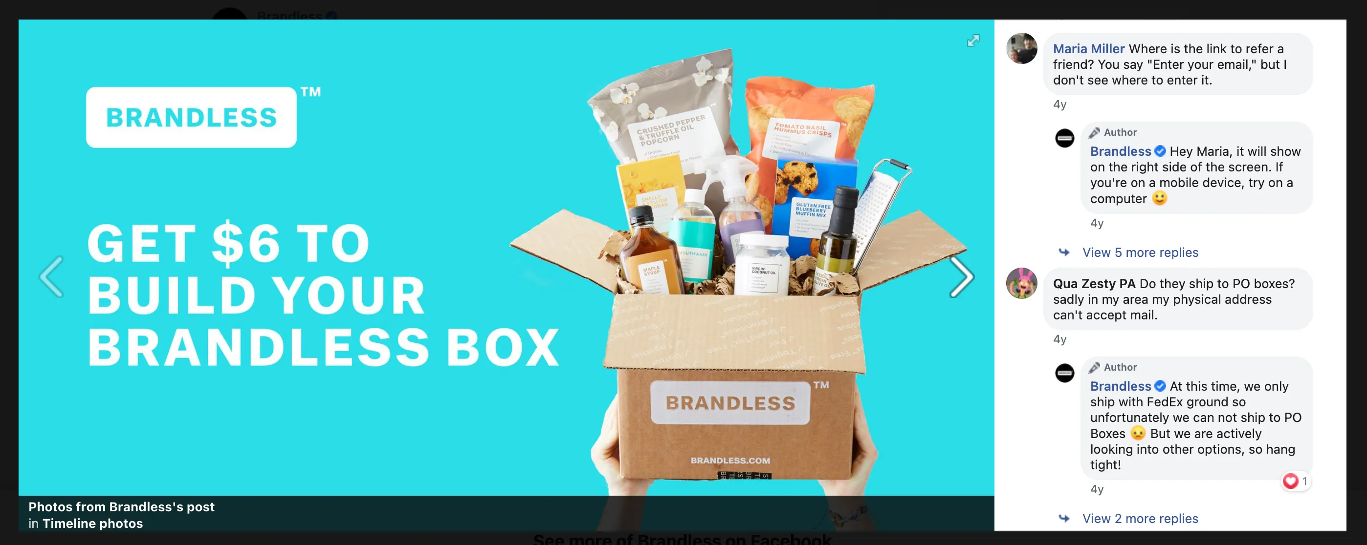
Image Source: Brandless Facebook Page
Brandless used Facebook for its invitation referral post.
We love how the look is appealing and tells consumers what they will get.
The post’s content also describes the program and how it will help the user.
In addition, the message also contains a clear referral CTA and a clear referral link.
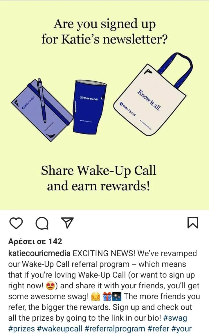
Image Source: Katie Couric Media Instagram Page
Katie Couric Media used its official Instagram account to share its referral program with new and existing customers.
Their social media post explains how the program works.
Through its picture, it also shows viewers that they may win referral rewards (like swag), and it includes a CTA that directs them to the link in their profile bio.
Therefore, this post is perfect for any user to invite friends and simultaneously act as a word-of-mouth marketing move.
Referral email invitations are an excellent way to reach out to consumers directly. Furthermore, with all of the email marketing tools accessible, you can quickly tailor and automate any message you send out.
Here are some things to include in a referral email invitation:
The purpose of your email should be apparent right away.
A consumer should be able to see why you’re contacting them at a glance, whether you say it in the subject line or as your first phrase.
If a consumer is unsure about your email, they will either ignore it or delete it. So instead, offer them a reason to read your referral email and open it.
As the email subject, use the referral program headline attractively.
To draw attention to the unique invitation, you can try using the following subject line:
“You’re asked to join because we believe you’re wonderful!” This gives your consumers the impression that they are members of a cool club, which creates a feeling of belonging.

Image Source: Really Good Emails
The Willow Real Estate referral program invitational email clarifies the program’s purpose and describes how users can engage with it.
It also has terms and conditions and a visible call-to-action button.
This program announcement works well for referred friends and as an email newsletter.
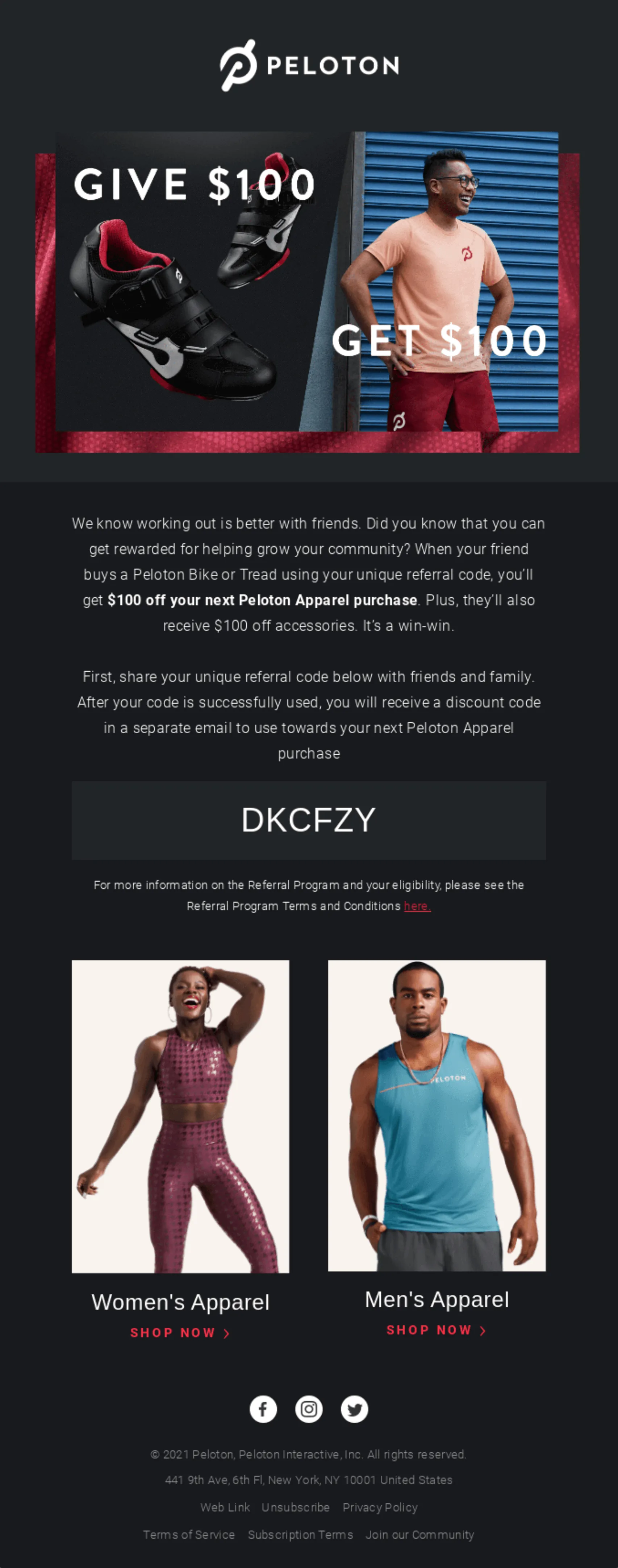
Image Source: Really Good Emails
Peloton’s referral invite email is excellent as it features engaging product images, describes the software and what the user can accomplish, and has clear calls to action.
It also includes social sharing icons to make it easier for users to spread the content for more exposure.
The key to scaling a referral program is promoting it once advocates have signed up.
As with any marketing strategy, it’s essential to keep people interested and enthusiastic to build word-of-mouth advertising.
Send your advocates timely emails or messages informing them of the number of referrals they’ve sent, new incentives they may receive, limited-time competitions, and any other referral program updates.
You have to let your consumers know what has happened in the background, like if they have invited certain people, and what are the required actions for the time being.
Let your customers know any extra information; for instance, if you’re offering additional gifts or discounts if they keep referring more friends.
The following examples highlight what we’re mentioning here.
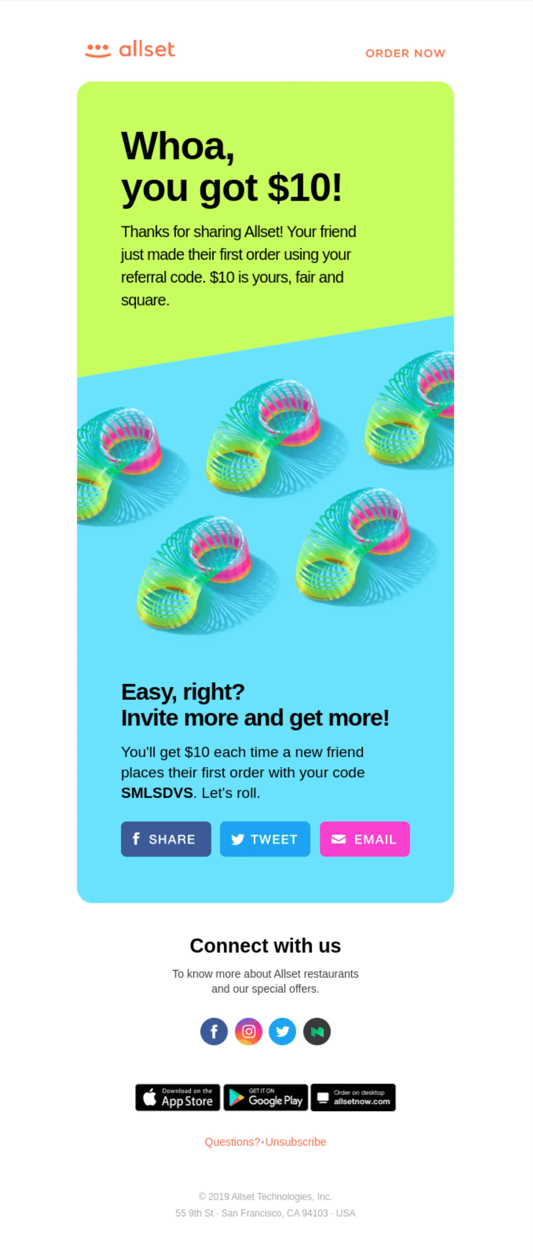
Image Source: Really Good Emails
The Allset referral program email feedback comes in a very nice, appealing green and light-blue color scheme.
It informs the recipients that they have received a prize through the referral program.
Also, it mentions that the bigger the prize will be if new customers are invited.
The message is just clear and straightforward.
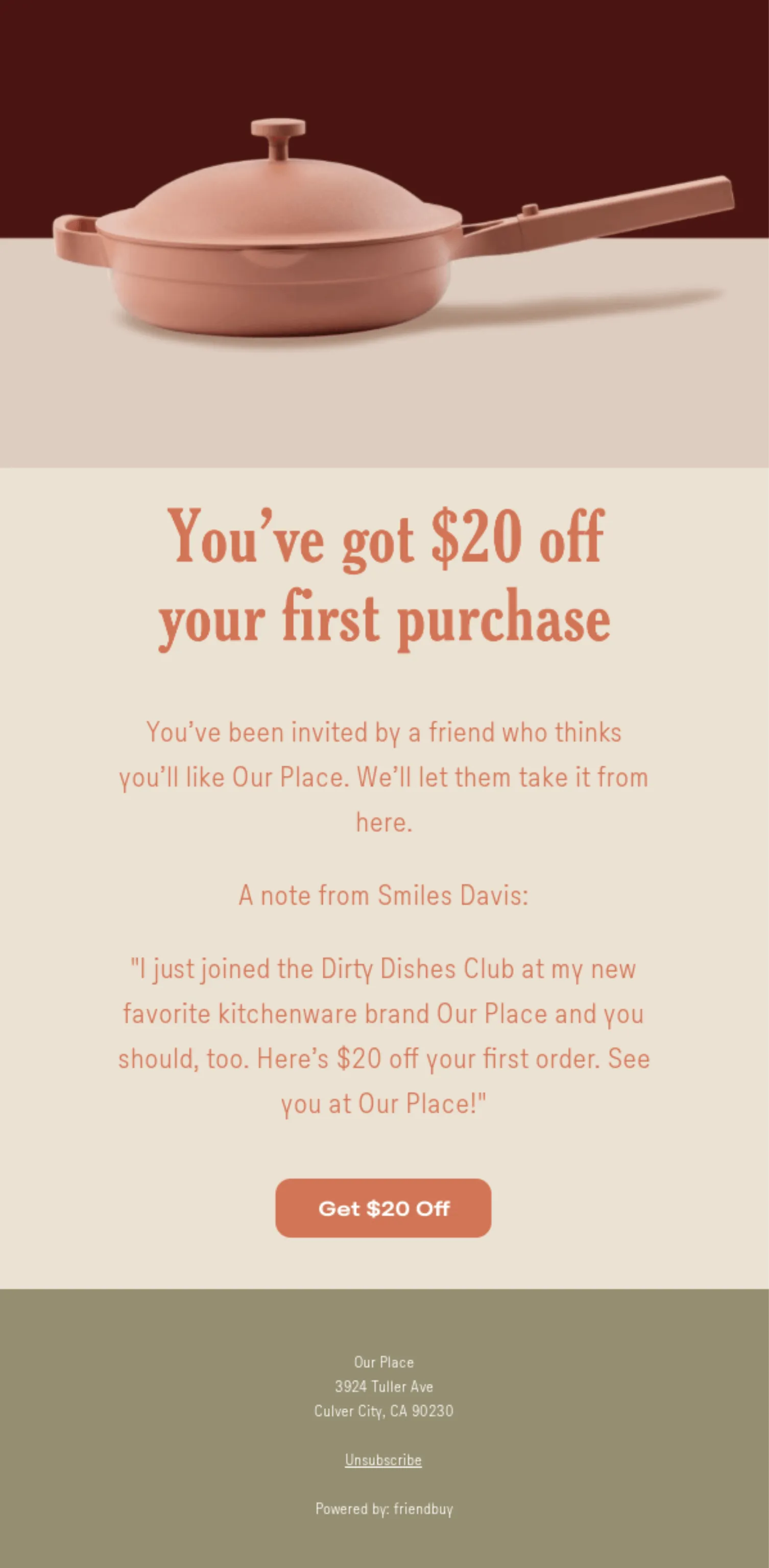
Image Source: Really Good Emails
Our Place’s email tells the receiver they received $20 off their first purchase.
The aesthetics of this email include a brown pot and an attractive backdrop of similar colors.
Furthermore, this email is excellent since it informs the user, describes what happened, and provides a crystal-clear CTA button.
We’re presenting you with some of our templates below; they can come in handy for many uses.
And the best part?
They’re totally free, so you can give them a try anytime, anywhere, with no restrictions!
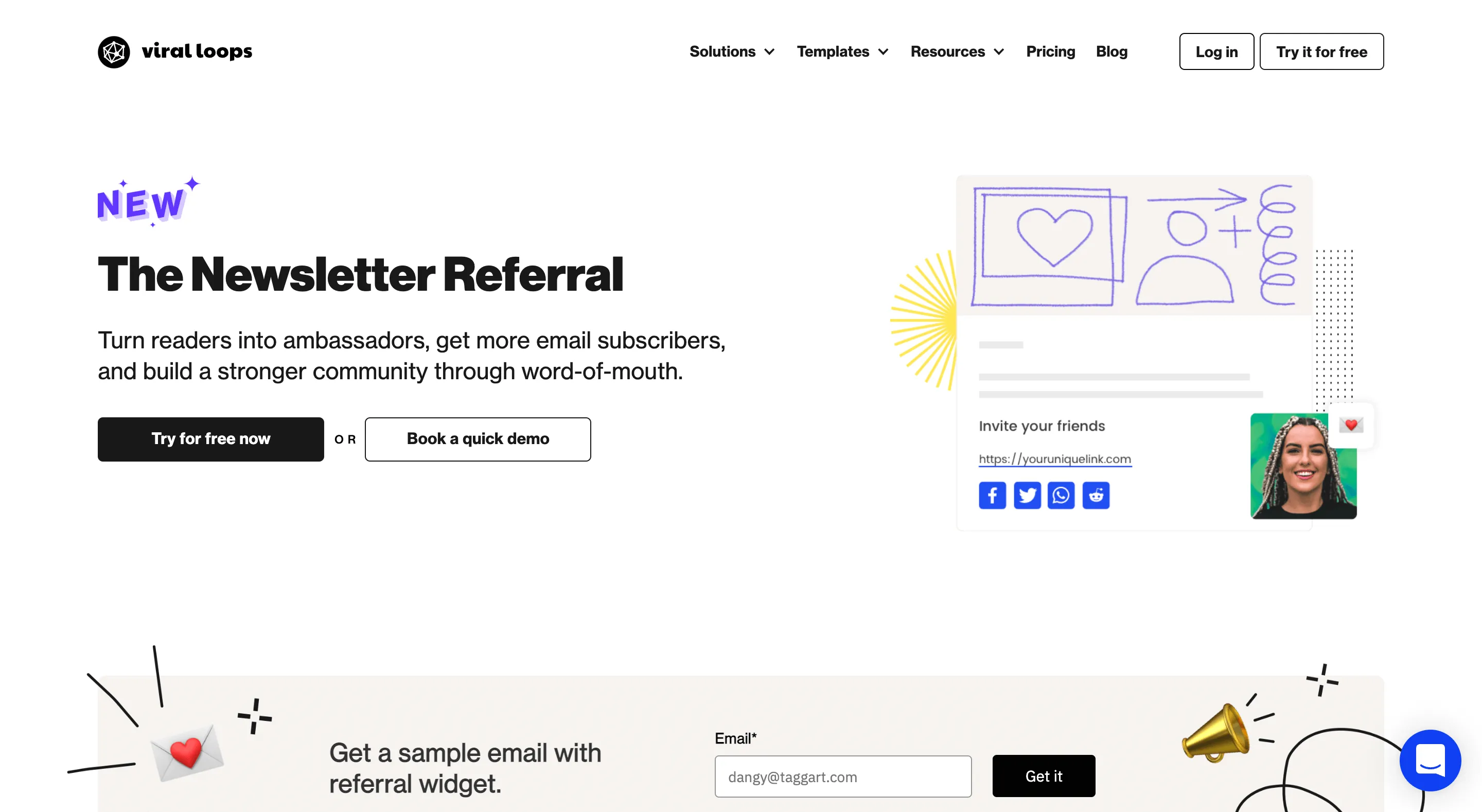
The newsletter referral email template can make readers become brand ambassadors, increase email signups, and foster a deeper sense of community.
To send an invitation to a friend, current subscribers need to connect to your email service provider by clicking the connect button.
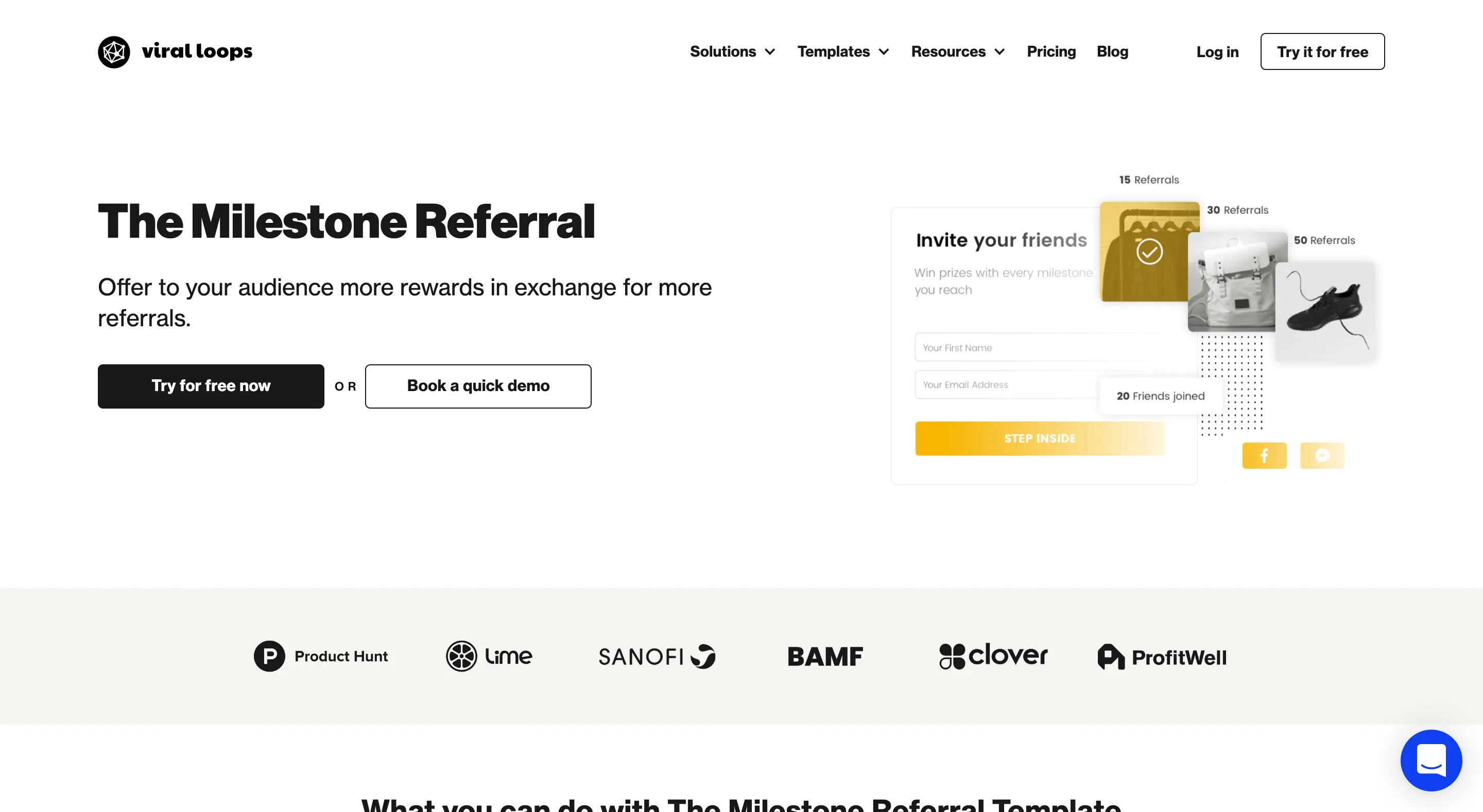
The milestone customer referral template helps you connect more with audiences as it offers your customers more prizes for extra referrals.
With the help of our multi-tiered incentive system, you can monitor your signups, combine this template with your form, and recognize successful referrals.
With the startup prelaunch template you can create a waitlist for your early adopters and give them early access and exclusive pre-launch items to launch your product with impact using this customer referral program template.
Give visitors the option to sign up for early access and pre-launch specials for your waitlist.
Also, they go up the list depending on how many friends they invite.
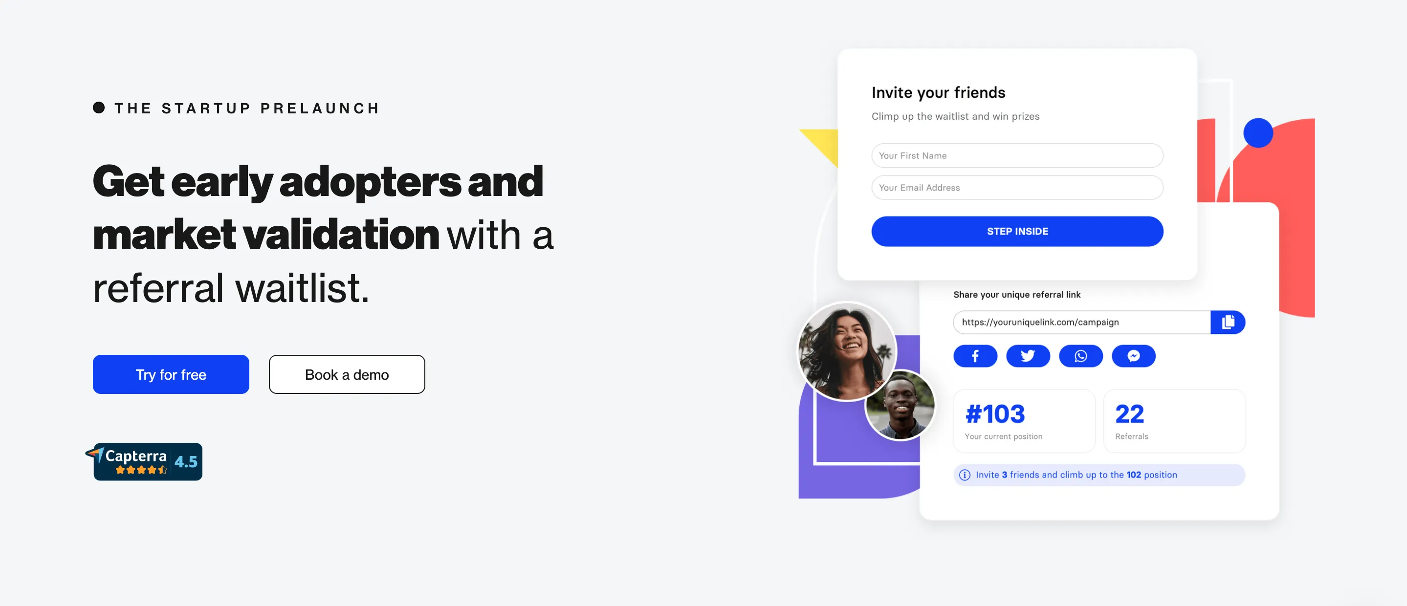
The more, the merrier.
Make this your best referral program by encouraging your customers to invite more of their friends to increase their chances of winning more prizes.
Moreover, remember that you on’t need to be a developer to create a landing page for your referral marketing campaign.
You can quickly design a unique landing page with Viral Loops Pages and their support!
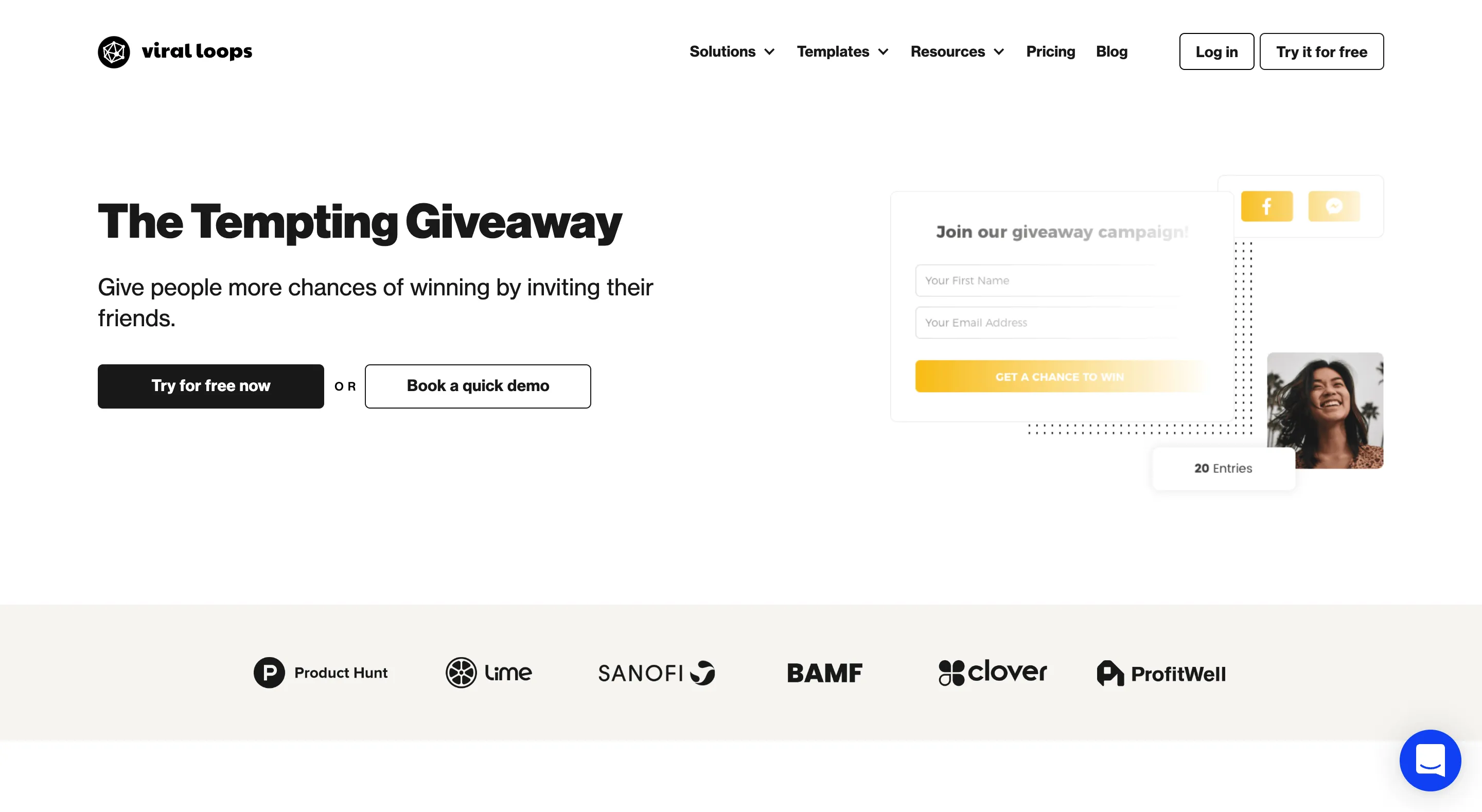
With the Refer a Friend template you can reate a traditional referral program and provide your consumers with incentives for referring their contacts to use your service with this one.
Also, we don’t want you to worry about your new referral program when it goes out into the world.
With our fraud-detection technology, you can always spot risks and maintain reasonable email delivery rates.
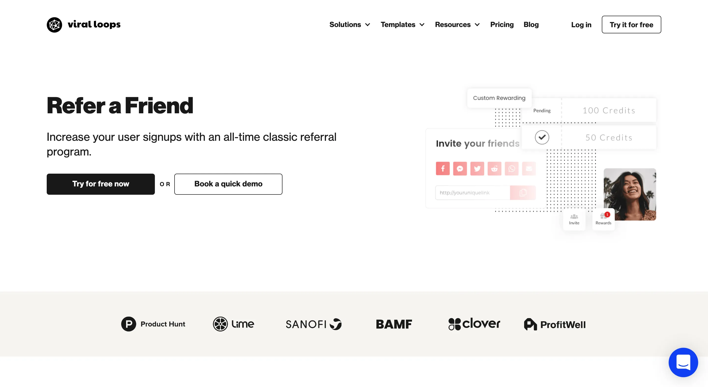
Use our leaderboard scoring system to populate your pre-launch list.
Also, users move up the scoreboard as they submit more recommendations.
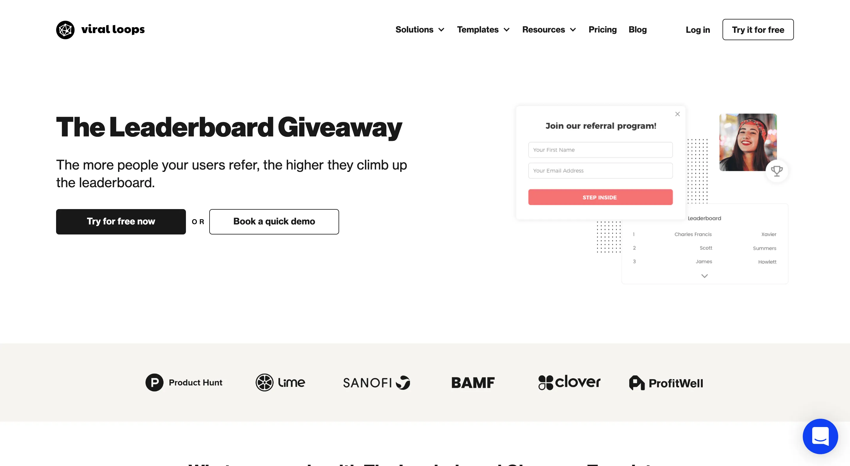
Obtain hot leads for your CRM, allow your users to close outbound deals, and provide them with incentives to do so.
If this is your first referral template, it will work well for any ecommerce endeavors you have in mind.
The most outstanding advertisement is always a satisfied customer. Ask your customers to invite their friends immediately when they have their “wow moment.”
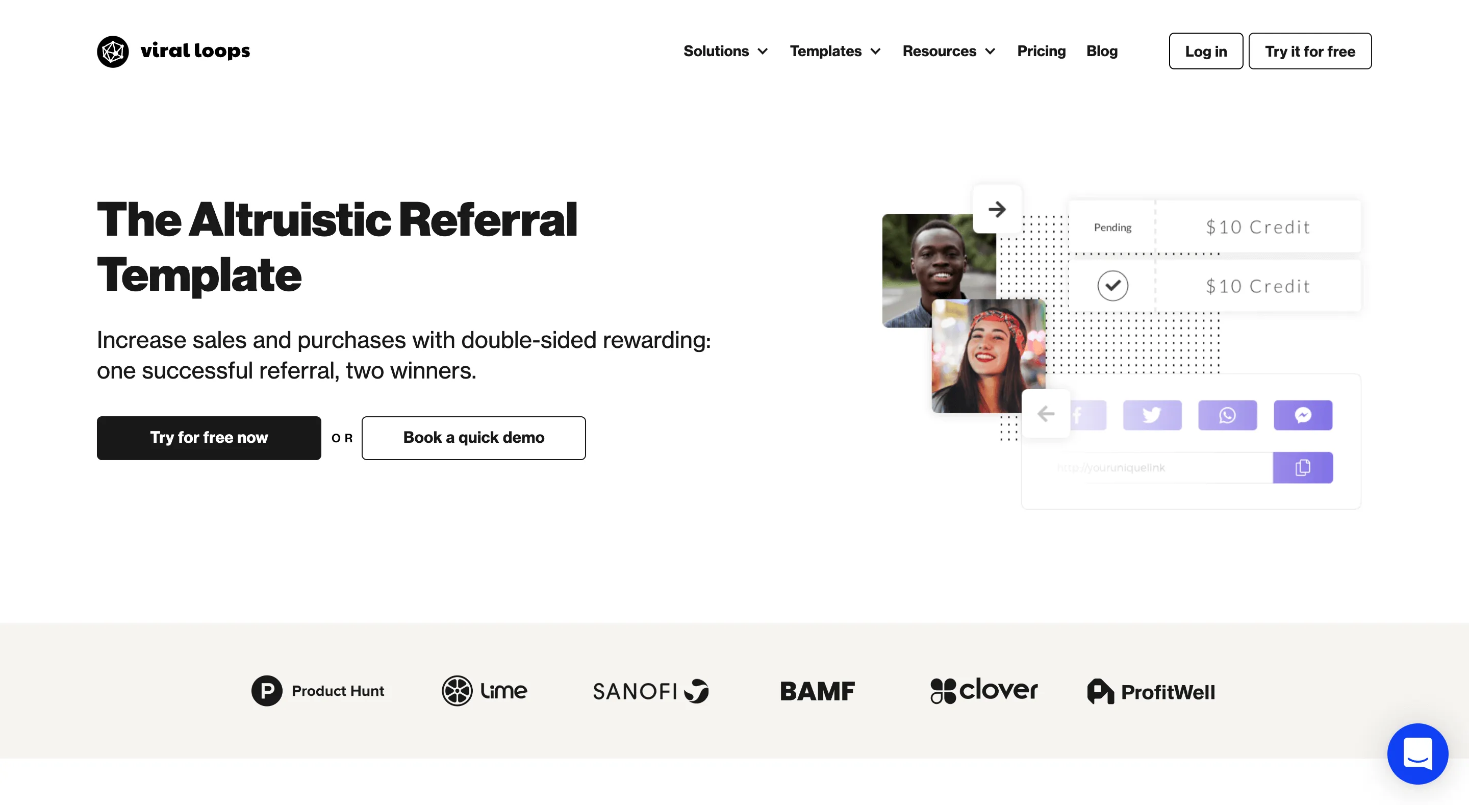
This referral template can increase your sales and bookings or optimize subscriptions via word-of-mouth.
Additionally, both parties benefit and get rewarded when users invite their friends and make a transaction.
It doesn’t get any better!
If you're not sure which one to choose, let's have a quick chat to help you out:
Now that you understand the importance of a referral program, it’s time to get started on your own.
Understand your target consumer (and communicate this to referrers), create an incentive, and make it simple for satisfied customers to suggest you.
Feel free to read more of our referral marketing blog pieces at any time if you need further guidance.
Thank you for stopping by!